Typography is often one of the most overlooked details in wedding design, yet it has the power to set the tone from the very first impression. Long before guests experience the tablescape or ceremony setting, they encounter your wedding through words—on the save-the-dates, invitations, signage, and even the smallest paper details. Finding the right typography isn’t simply about following trends; it's about choosing fonts that reflect the atmosphere you want to create. With the right typeface, here is how you can create stationery that feels aligned with your celebration.


Playful Handwriting
Handwritten and scribbly fonts bring an immediate sense of friendliness and joy. They feel personal, expressive, and slightly imperfect—all in the best way. Reminiscent of handwritten notes or sketches, these fonts work beautifully for couples who want their wedding to feel warm, relaxed, and intimate. They’re especially effective for welcome signage, place cards, menus, or accent text paired with a more structured primary font.


Modern Sans Serif
Clean, structured, and understated, sans serif fonts are defined by their simplicity. With no decorative strokes, these typefaces feel timeless and refined, making them a strong choice for any modern stationery design. Sans serif fonts shine on invitation suites with generous spacing, sleek menus, and signage where clarity matters. They pair particularly well with minimalist palettes and vibrant pops of colors.


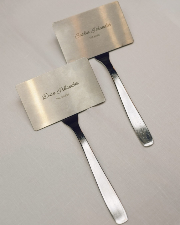
Classic Calligraphy & Cursive
For a stationery suite that evokes romance, opt for script and cursive style fonts. With flowing lines and elegant movement, you can create vintage-inspired wedding invitations, menus, and more that feel timeless and traditional. However, these fonts work best when used selectively, highlighting the most important details and paired with a simpler secondary font to avoid sacrificing readability.


Bold & Funky
Bold typography makes an immediate impact. With strong letterforms and confident weight, these fonts are ideal for couples who want their wedding design to feel graphic, retro or maybe a little out of the ordinary. They work particularly well for signage, seating charts, and editorial-style invitation layouts. When used in bold yet monochromatic colorways, you'll create stationery full of visual contrast.


Elegant Serif
Serif fonts are characterized by their small decorative strokes, which lend them a sense of timelessness and sophistication. Elegant serif typography feels rooted in traditional wedding stationery while still remaining endlessly versatile. If your wedding is leaning more minimalist yet elevated, opt for this style font for invitations, ceremony programs, and other printed details that call for a polished finish. They pair beautifully with both classic and modern color palettes.