When it comes to wedding color palettes, 2026 is all about leaning into contrast. Instead of relying on a single mood or shade to set the tone, couples are pairing neutrals with richer, more expressive hues to create palettes that feel layered and intentional. Buttery ivories meet antique gold, cool blues are grounded by contrasting browns, and soft pinks are sharpened with warm neutrals. It’s a shift toward balance. Bold without being overwhelming, faint without fading into the background, and undeniably modern. Together, these six color combinations signal a more nuanced, expressive direction for 2026 weddings.


Tolu Adeko, Photography: Darren Chung
Ra&co Design, Ivory Made Studio, Photography: Gemma Thomas
Canary Yellow & Plum
Canary yellow and plum plays with contrast in a more expressive way. Yellow brings brightness and immediacy, while plum adds weight and depth, keeping the palette from feeling one-note. Used together, the combination feels graphic and intentional rather than playful or themed. It works especially well when yellow leads in lighter touches — linens, paper goods, or small tabletop moments — with plum coming in through florals, fruit, or candle accents. The balance between the two creates a look that feels confident, modern, and a little unexpected without overpowering the space.


Powder Blue & Chocolate Brown
Powder blue and chocolate brown is one of those combinations that feels quietly confident. We’ve seen it take shape in fashion first, with soft blues paired alongside rich browns on runways, and it translates just as effortlessly to weddings. The contrast is what makes it work: powdery, cool-toned blues bring lightness, while chocolate brown adds depth and warmth. It’s also a palette with range. Lean into paler blues for something airy and romantic, or move toward slate or steel tones for a moodier take, all grounded by brown accents — think blue tablecloths layered with chocolate-toned florals or warm wood furniture — that keep the look rich and composed rather than sweet.


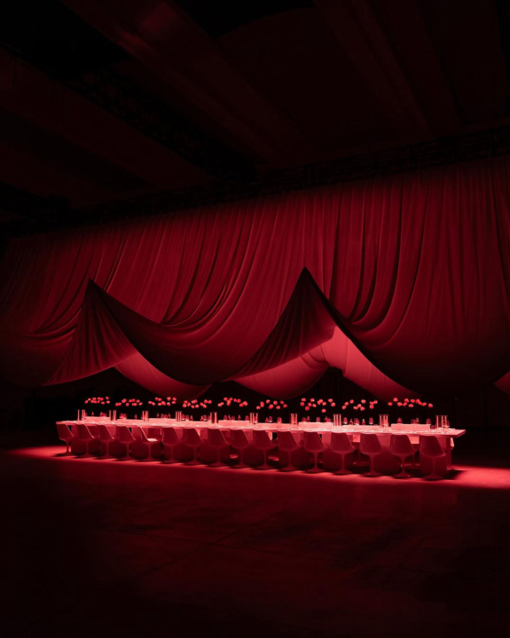
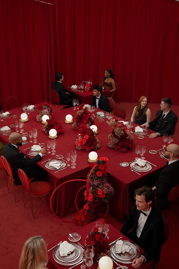
Antique Gold & Buttery Ivory
There’s something about gold and ivory that feels inherently elevated, but this version keeps it grounded. Think buttery ivory as the base, layered with antique gold that shows up through texture rather than shine. Velvet draping or curtains add depth and softness, while rustic elements — worn wood, stone, or patinated metals — keep the look from feeling too polished. It’s gilded glamour with a modern edge: warm, tactile, and confident without being precious. The kind of palette that feels just as right in a historic space as it does in a more minimal setting.


Tolu Adeko, Photography: Darren Chung
Sam Pauletto
Alice Wilkes Design, Photography: Jack Henry
Angelica Lisa
Bryant Projects, Photography: CFH London
Pri Oliveira, Ana Flor, Photography: Yellow Estudio
Heirloom Pink & Aubergine
This color story leans darker, softer, and more atmospheric. Heirloom pink shows up with a muted, almost vintage quality — less blush, more patina — while aubergine introduces depth in a way that feels polished rather than heavy. The pairing works beautifully when it’s allowed to feel tactile: layered florals in dusty pinks and deep purples, velvet or silk accents, and tablescapes that favor shadow and contrast over brightness. It’s romantic in a grown-up way, grounded in texture and tone rather than sweetness, and ideal for couples drawn to palettes that feel expressive, moody, and quietly self-assured.


Saffron Orange & Chrome
This pairing feels sharp and intentional from the start. The orange tones lean saturated and warm, bringing intensity and presence, while chrome silver cuts through with a cool, high-gloss edge. Together, they create contrast through reflection and depth rather than restraint. It works best when clean finishes lead the way — polished chrome tables, reflective surfaces, and sculptural metal accents paired with richly colored florals, glassware, or textiles. The result feels bold, graphic, and modern, with a high-impact look that still feels controlled.


Petal Pink & Dusty Tan
Soft without feeling sweet, this pairing is all about restraint. Petal pink brings warmth and subtle color, while dusty tan grounds the palette with an earthy, sun-worn feel. Together, they read modern and understated rather than overtly romantic. It’s a combination that works beautifully through texture: blush-toned florals against linen tablecloths, tan ceramics, stoneware, or natural wood. The effect is relaxed but intentional, perfect for couples drawn to color that feels lived-in, tonal, and quietly confident.


Cordero Atelier
Paloma Events, Mrs. Gibbons Flowers, Photography: House of Lucie
Maria Flores, Fernada Martinez, Photography: The Vrnclr
Merrilee Liddiard
Christiana Perry
Omer Gilony, Maison Fnc, Photography: Jack Henry