Though spring hasn’t fully sprung yet, we’re already dreaming in color. Spring 2026 is shaping up to be a season of bold contrast, tonal layering, and palettes that feel expressive rather than expected. Couples are moving beyond safe neutrals and leaning into combinations that feel intentional, artful, and just a little bit daring. Think florals anchored by one striking shade instead of a wash of pastels, cakes finished in ombré hues, and color pairings you wouldn’t immediately put together - yet somehow make perfect sense the moment you see them. So here are nine fresh color pairings we’re especially into — and expect to see everywhere come Spring 2026.


Powder Blue & Cherry Red
Cool meets crisp in this pairing that feels polished and undeniably fresh. Powder blue creates an airy, almost porcelain backdrop, while cherry red introduces a precise, saturated pop that keeps the palette from feeling too soft. Pale blue ceremony draping paired with tight clusters of red gladiolus or anthuriums reads intentional and elevated, especially in photographs where the contrast feels clean and graphic. Powder-toned linens layered with glossy red accents in signage, or a soft blue cake finished with a single vivid bloom, make the combination feel composed rather than thematic. The effect is balanced, modern, and striking without trying too hard.


Juan Pablo Partida, Photography: Visor
Studio Linné
Art Petrov, Content: Artyom Smith
Art Petrov, Content: Artyom Smith
Gigi and Roses, Photography: Fotis Sid Tasios
Juan Pablo Partida, Photography: Visor
Walnut & Cream
A delicious walnut and cream pairing is proof that restraint can still make a statement. The depth of walnut brings warmth, structure, and a sense of permanence, while cream softens the palette with light and restraint, allowing form and craftsmanship to take the lead. There is an unmistakable old world atmosphere to the combination, the kind that feels at home beneath low lighting, polished woods, and the hush of a supper club or an Art Deco inspired soirée. Together, they create a study in contrast that feels intentional rather than decorative, a pairing rooted in texture, tone, and timeless proportion rather than fleeting color.


Bryant Projects, Photography: CFH London
Caro Diario
Kristina Morozova Decor
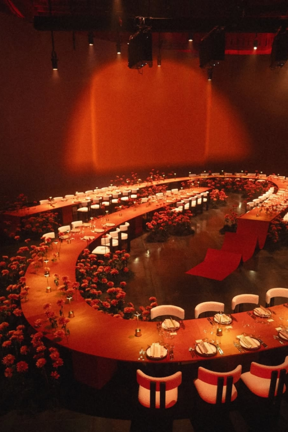
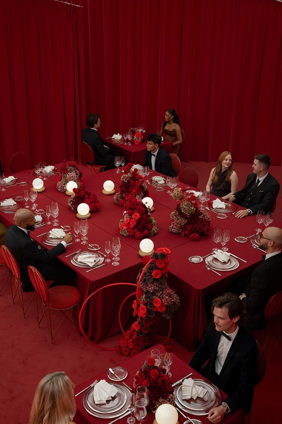
Dusty Rose & Deep Crimson
Dusty rose and deep crimson create a palette that feels layered and emotionally rich rather than overtly romantic. The muted blush tone acts as a soft, matte foundation, allowing deeper crimson accents to move through the design with intention and weight. In florals, that might look like pale peonies or garden roses punctuated with saturated anthuriums or velvety red stems woven throughout. On the table, blush draping paired with wine-toned stationery or lacquered red details keeps the palette grounded and dimensional. The overall effect is intimate and textural, a study in depth rather than sweetness.


Attepmt
Alice Wilkes, Photography: Ha Nguyen
Dada Island
Alice Wilkes, Photography: Ha Nguyen
Kith
Ted & Anna
Mauve & Tangerine
Confident, saturated, and unexpectedly harmonious. Tangerine brings warmth and movement, while mauve introduces depth that keeps the palette grounded. The contrast feels bold but considered, especially when hydrangeas or orchids in rich violet tones are layered with sharp orange poppies or gerberas. Even subtle citrus accents woven into deeper purple florals can feel intentional rather than literal. This pairing thrives in layered tablescapes and statement arrangements where the color does the talking. Vibrant, expressive, and impossible to ignore.


Cordero Atelier
Cordero Atelier, Photography: Sophie Berard
Rhea
Antique White & Dusty Grey
A lesson in subtlety, proving softness can still carry presence. Antique white lends warmth and familiarity, while dusty grey introduces shadow and dimension, grounding the palette with quiet sophistication. Together, they add depth and nuance to Pantone’s Color of the Year, Cloud Dancer, allowing its airy optimism to feel considered rather than weightless. The result is an atmosphere that feels gently timeworn yet modern, equally suited to layered textiles, sculptural florals, and intimate celebrations where tone and texture do the storytelling.


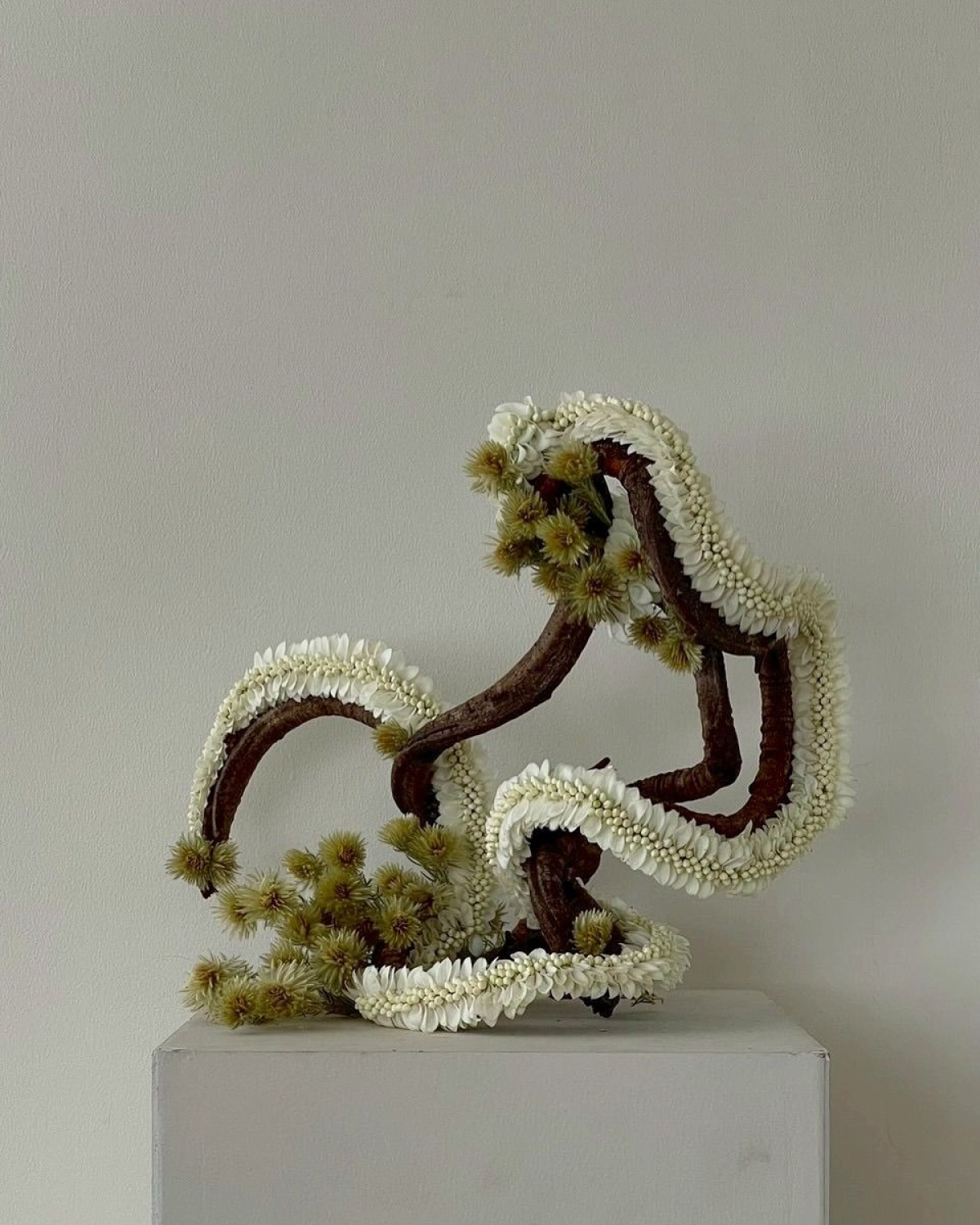
Matcha & Burgundy


Chartreuse & Bubblegum Pink
High contrast. High impact. Zero subtlety... in the best way possible. Chartreuse brings that electric, ever so slightly fluorescent green energy, while bubblegum pink softens the edge just enough to keep it playful. Together, they feel bold and slightly surreal. Glossy pink cakes against lime-toned draping, anthuriums and ranunculus layered in punchy installations, or even unbloomed sunflowers and sharp green stems woven through pink-heavy arrangements for that unexpected contrast. It’s modern garden, but far more aesthetic, especially when the pink leans satin and the green leans glossy.


Apricot & Petal Pink
Warm, tonal, and quietly luminous. Apricot adds depth and glow, while petal pink keeps the palette airy and romantic. This combination lends itself beautifully to garden roses, sweet peas, and softly layered ranunculus in sunset-adjacent tones. You can lean slightly rustic with textured linens and sun-washed florals, a subtle nod to spring that never tips into countryside cliché. Sheer peach fabric draped over pale pink blooms and rosé towers catching golden-hour light complete the look. Soft, but never saccharine.


Byv.studio
Abhi Studio, Photography: Abhi Studio
Paloma Events
Fresh Green & Daffodil Yellow
There’s something unmistakably spring about this pairing, but it never feels predictable. Citrus green and daffodil yellow together read crisp and sunlit, more fresh market morning than pastel garden party. Tulips, orchids, daffodils, and sharp green stems clustered in tonal waves give the palette movement, especially when layered against clean linens or subtle ivory backdrops. A cake washed in soft green fading or topped with buttery yellow edible petals, feels modern rather than nostalgic. The effect is light, bright, and quietly confident.