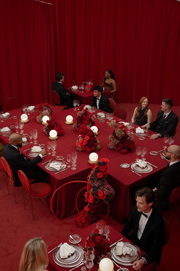
From opulent tablescapes to sculptural florals, every element of a wedding is considered, composed, and deeply personal — yet one detail has long been treated as purely functional: the seating chart. Today, they're stepping into the spotlight as design statements in their own right — layered, tactile, and concept-driven. Think embroidered linen panels and fluid silk installations that move with the space, destination-led charts that map out your story through places that matter, or monochrome compositions where color and typography do all the talking. Elsewhere, greenery is no longer just décor but structure, woven seamlessly into the display, while oversized draped fabrics bring a sense of scale and quiet drama to even the grandest venues. Consider this your invitation to rethink the piece everyone interacts with first — and remembers long after.
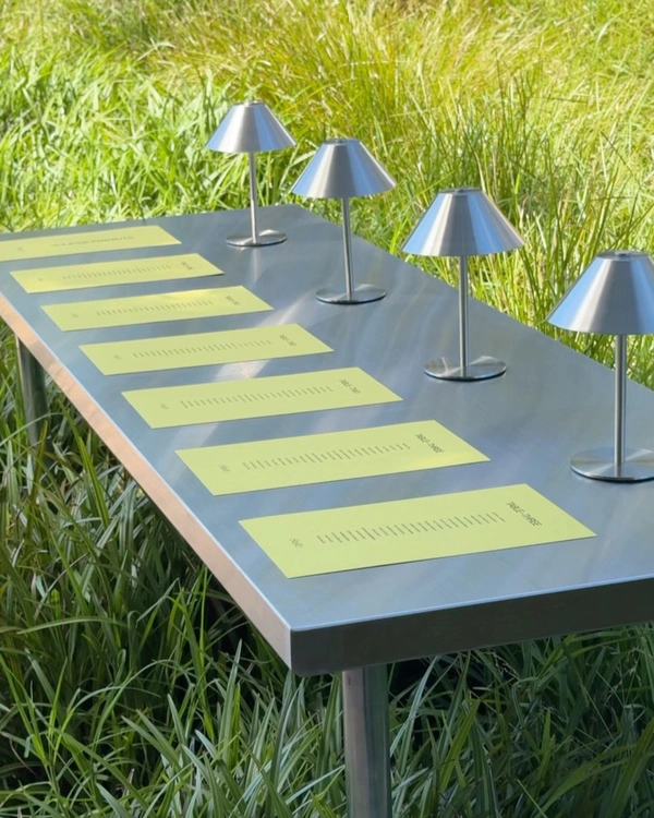
Swatch Statements
Color swatches turn a seating chart into a full design statement. Whether you commit to a single saturated hue or embrace the entire spectrum through a seamless rainbow gradation, the effect feels graphic, playful, and unexpectedly refined. With the palette doing the heavy lifting, the focus shifts to composition, spacing, and texture, proving that sometimes the simplest concepts make the boldest impact.
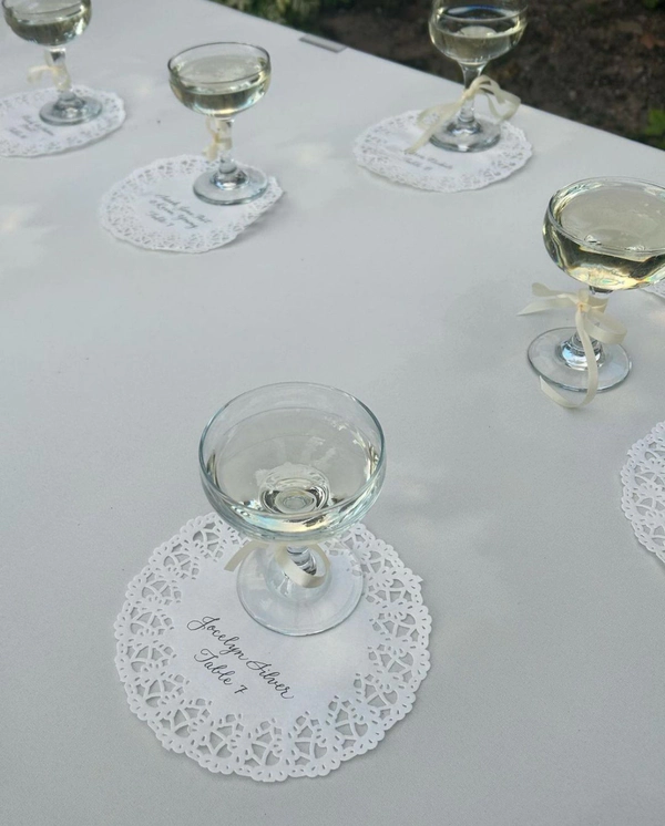
Vintage Coded
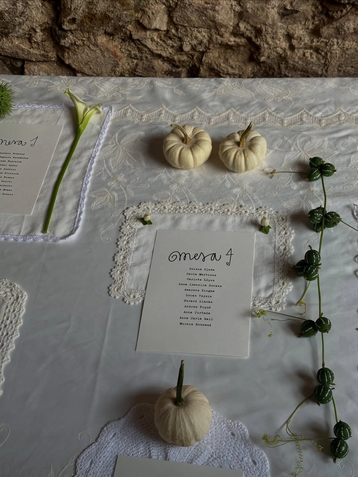
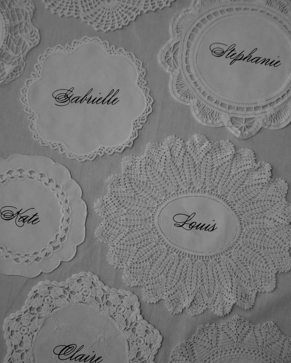
Vintage-inspired seating charts are bringing a softer, more sentimental kind of romance to the seating chart. Think repurposed doilies layered beneath place cards, delicate lace and crochet trims, antique silverware turned table numbers, all finished with handscripted calligraphy that feels lovingly imperfect. Washed in ivory, buttercream, blush, and faded pastel tones, the overall effect feels collected rather than constructed, like discovering a box of beautiful heirlooms from another era. Nostalgic, tactile, and full of charm, it’s a look that feels both deeply personal and quietly poetic.

Paired with Pottery
Elevate your seating chart into a sculptural, design-forward display by incorporating handmade ceramics. Whether you choose personalised clay vases, miniature pots, or delicately glazed vessels, these pieces double as functional keepsakes. Display them on draped linen, alongside seasonal produce, or nestled in moss or sand to create a grounded, organic look.

Bauhaus Effect
For a refined approach to your seating chart, this modernist moment is all about restraint. Think clean lines, sculptural spacing, graphic typography, and intentional negative space that allows every detail to breathe. Inspired by gallery installations and Bauhaus-inspired design principles, these seating charts transform simplicity into something strikingly elevated. Neutral palettes punctuated with a pop of color, architectural forms, and tactile materials like thick linen stock or brushed metal accents create a look that feels contemporary, artful, and quietly dramatic.

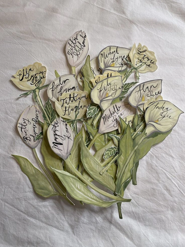
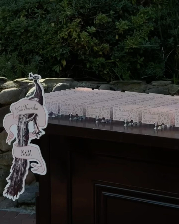
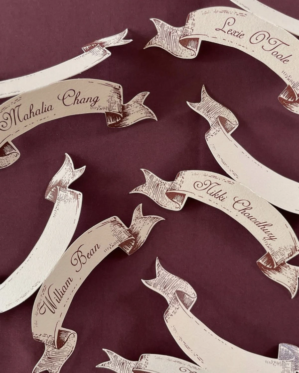
Artisan Storybook Style
There’s a renewed fascination with old-world detail — the kind that feels discovered rather than designed. Think ribbon banners, delicate linework, and typography that echoes antique engravings, as if lifted from a forgotten book. Seating charts and place cards take on a narrative quality, each name nestled within illustrated scrolls or softly shaded motifs. It’s romantic, but not overly precious — there’s a grounded craftsmanship that keeps it modern. The palette often leans warm and muted, allowing the intricacy of the artwork to lead.
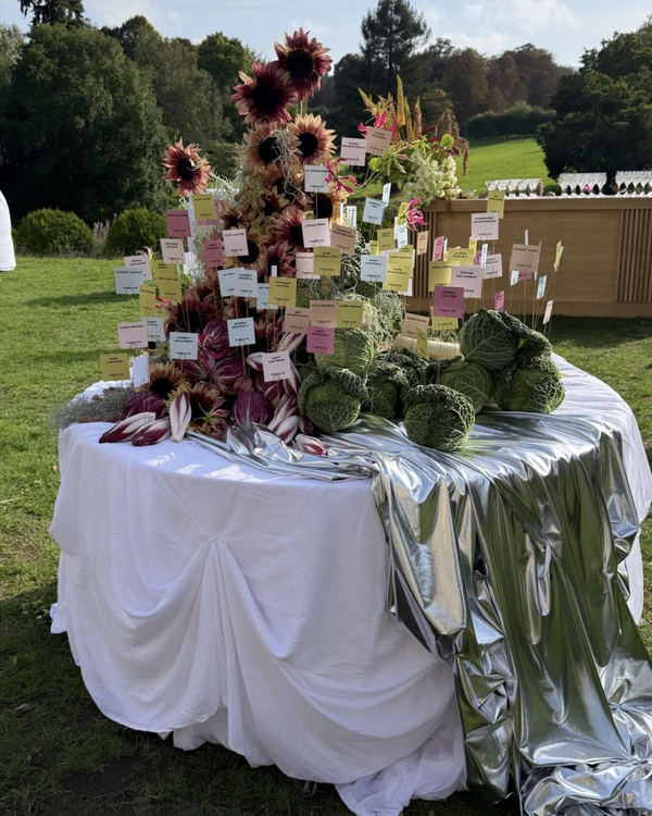
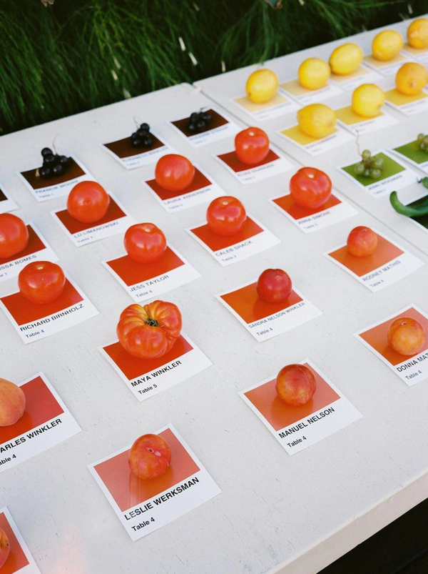
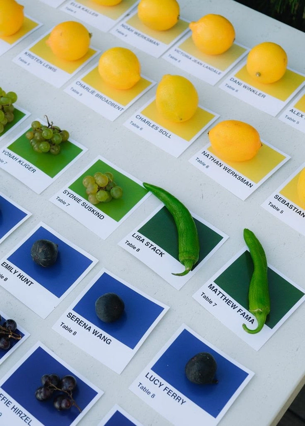
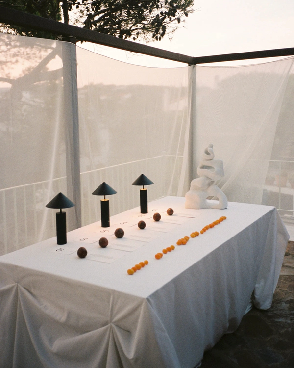
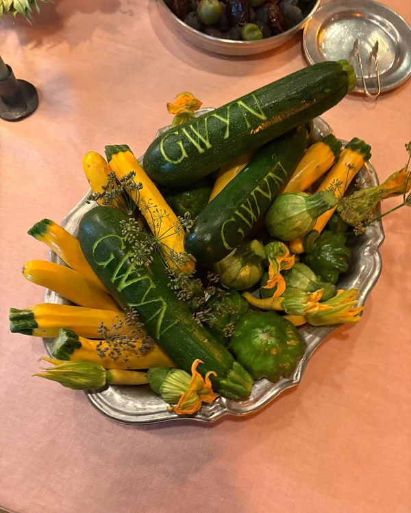
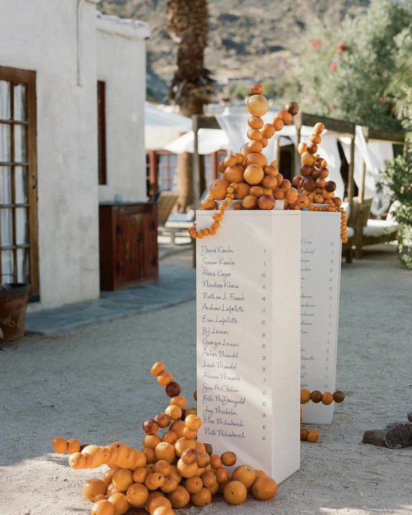
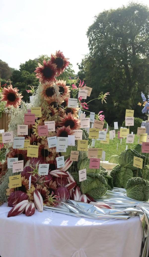
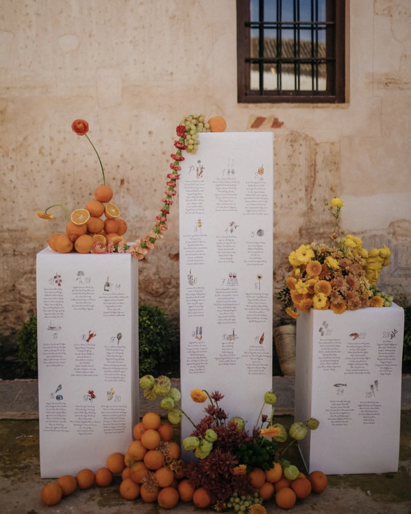
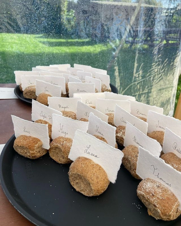
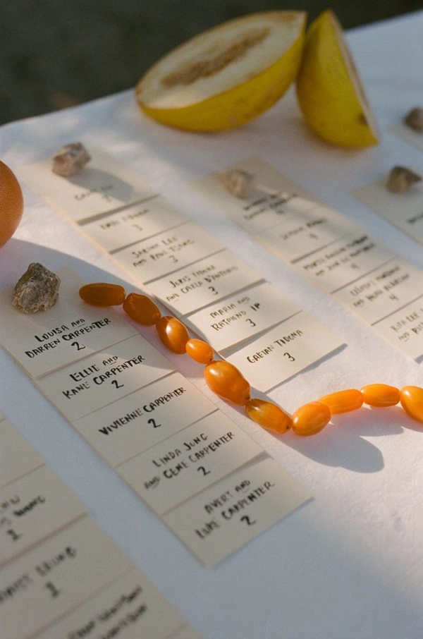
From Market to Table
Fresh produce is becoming the unexpected hero of the seating chart. From citrus and heirloom tomatoes to crusty loaves of bread, artichokes, eggs, figs, pears, and bundles of herbs, couples are turning market finds into playful design details that feel both sculptural and organic. Carve, pin and tie names directly into produce, or layer between seasonal ingredients for a look that feels effortlessly abundant. Beyond looking beautiful, it brings texture, scent, color, and a sense of seasonality to the space, like a still life painting guests can walk through. The key is leaning into produce that feels locally sourced, slightly imperfect, and true to the mood of the wedding itself.
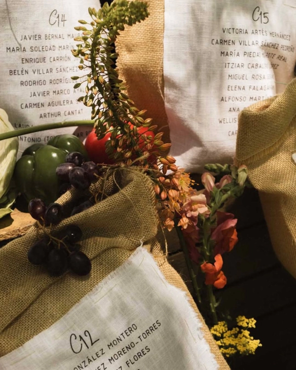
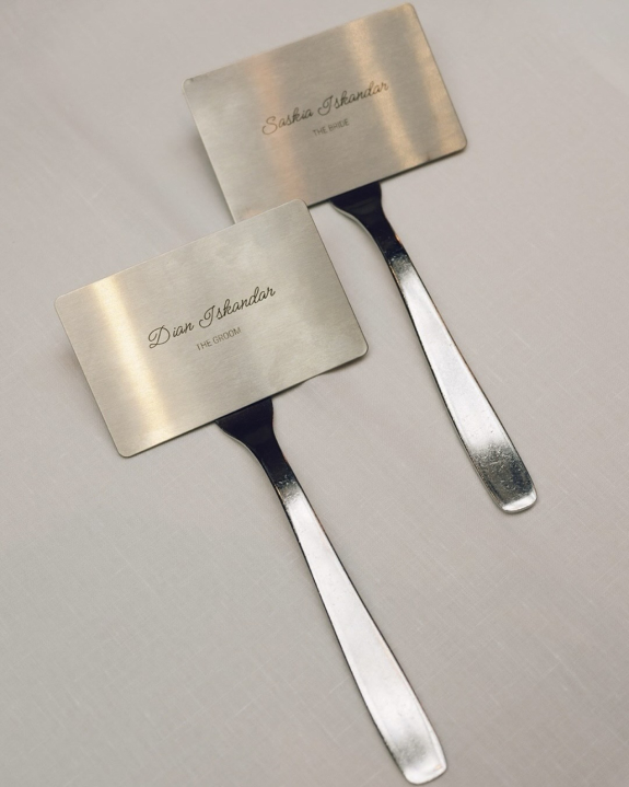
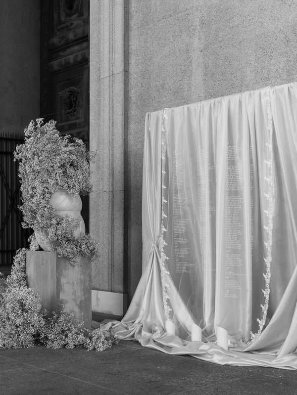
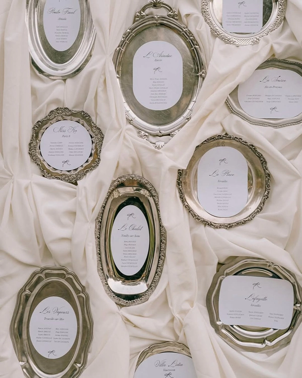
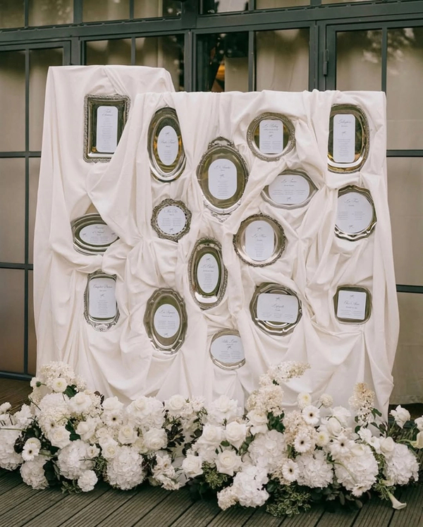
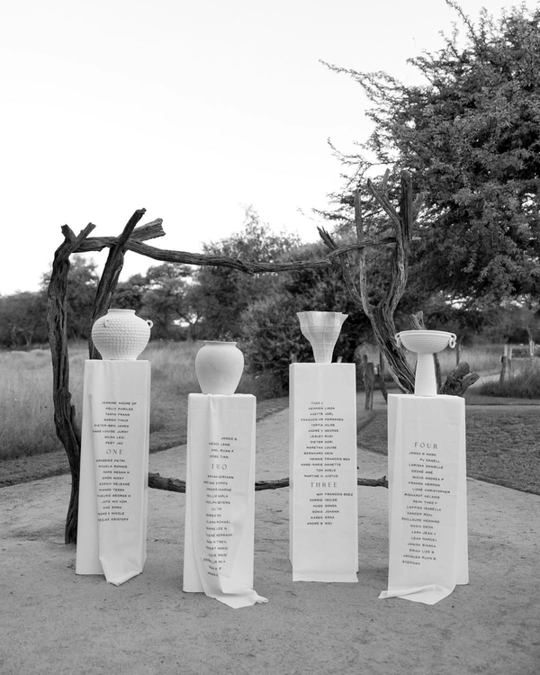
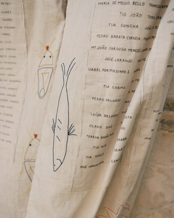
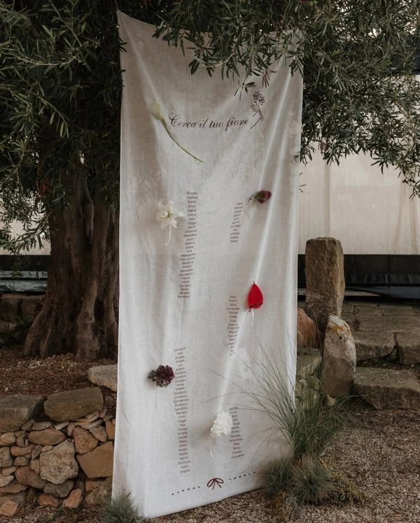
Bespoke Fabrics
There’s something quietly powerful about stationery that moves — fabric that catches light, shifts with air, and softens a structured space. Couples are turning seating charts into tactile pieces, commissioning embroidered linen panels or fluid silk installations that feel closer to couture than paper goods. Names stitched in thread or printed onto raw textiles bring a sense of permanence, as if each guest is woven into the day itself. The beauty lies in the imperfections: the slight irregularity of embroidery, the way silk creases and folds. These pieces don’t just guide guests — they become part of the atmosphere, absorbing the palette and mood of the room.

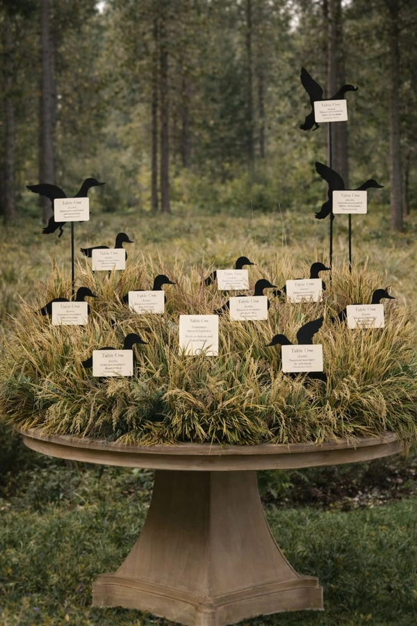
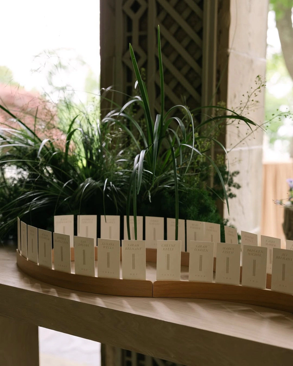
Woven with Greenery
Greenery, when approached thoughtfully, becomes more than an accent — it becomes structure. Seating charts are integrated into living installations, with names nestled among reeds, branches, or sculptural foliage. The effect feels organic but considered, avoiding anything overly rustic or predictable. It’s about layering — paper or fabric intersecting with natural elements in a way that feels seamless. Light filters through leaves, casting shadows across names and textures, adding movement without effort.
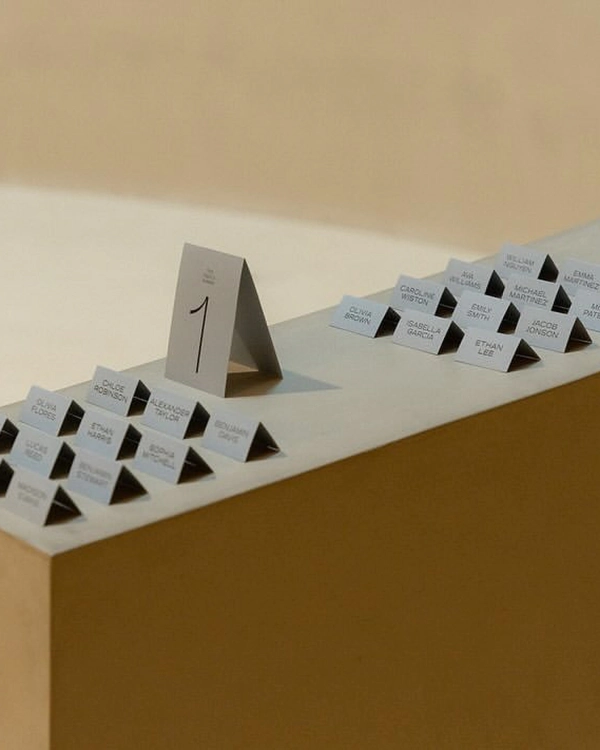
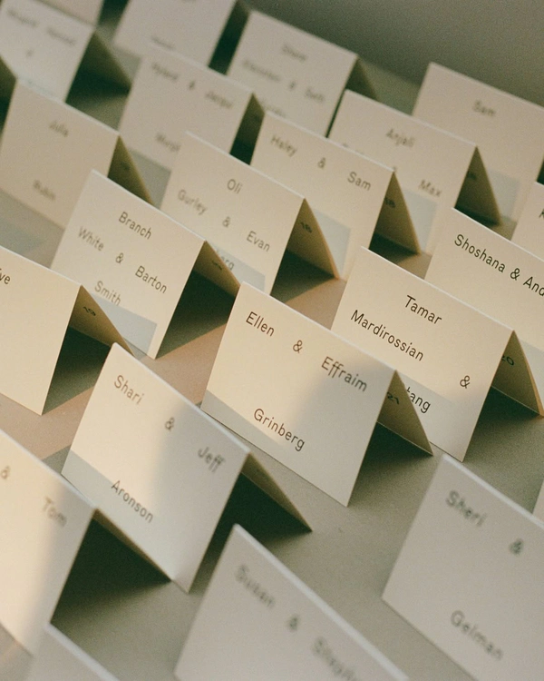
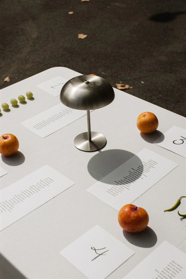
The Art of Placement
Sometimes, the smallest gesture feels the most deliberate. Minimalist place cards — pared back to typography and material — bring a sense of clarity to the table. The focus is on proportion, spacing, and type choice, often drawing from fashion or editorial design references. A single name, perfectly set, becomes enough. Materials matter here: thick cotton stock, translucent vellum, or subtly textured papers that elevate the simplicity. There’s no need for embellishment when the fundamentals are this considered.