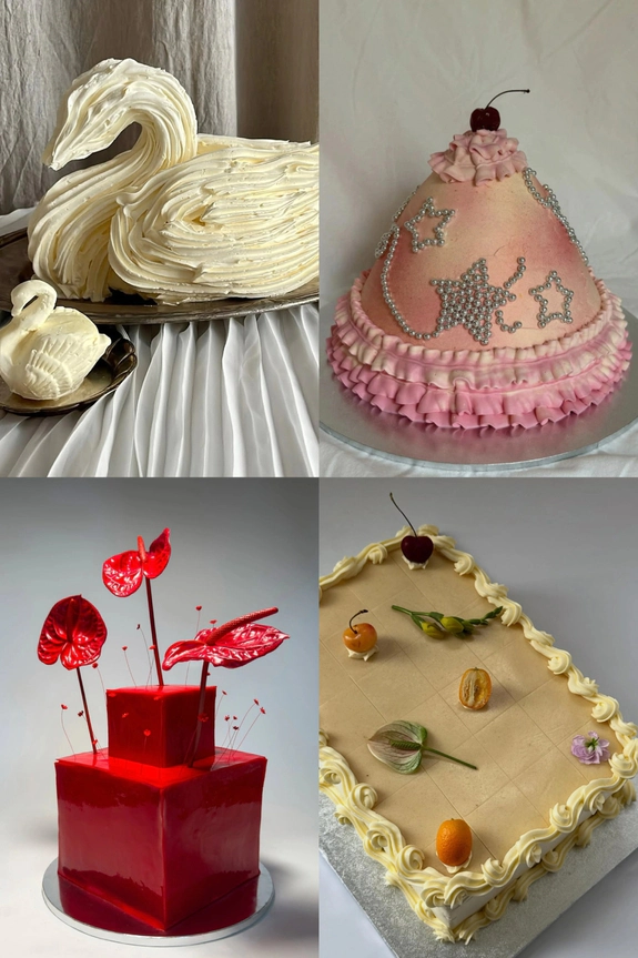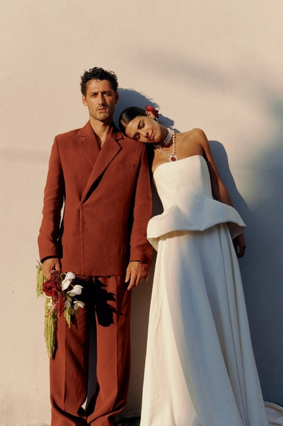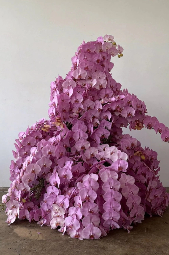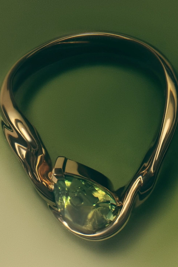
Every year, the color world hands down its verdict, and every wedding season decides which shades are worth the investment. For 2027, the list skews bolder than anything we've seen in years: violet instead of sage, marigold instead of butter yellow, berry red instead of burgundy. These aren't safe choices, and that's exactly what makes the future of weddings look so exciting. We unveil the six shades set to take over florals, cakes, stationery, and every tablescape in between over the next twelve months. Here's what to consider before you commit to a swatch.
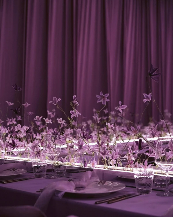
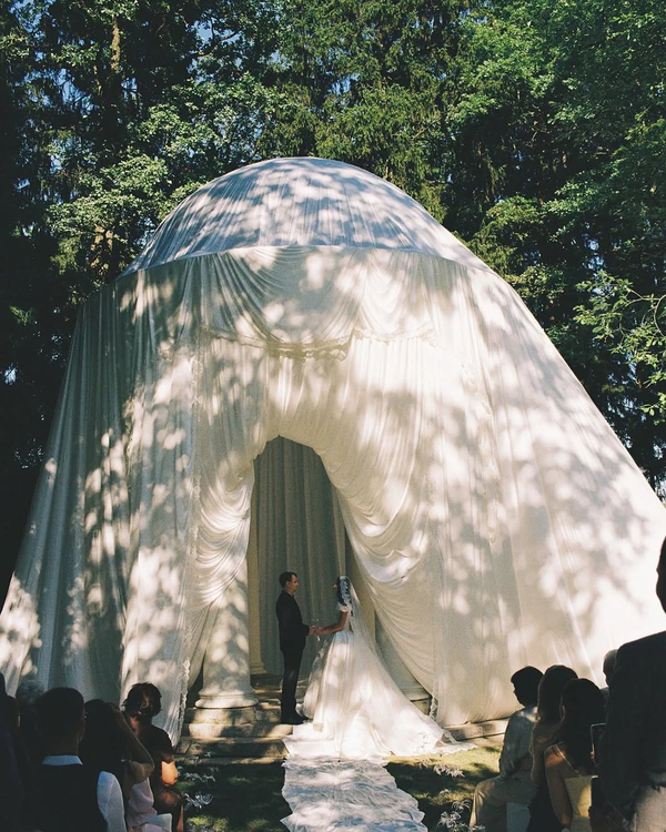
Vivid Violet
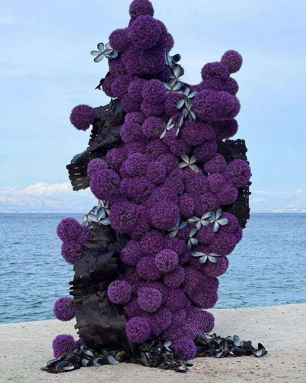
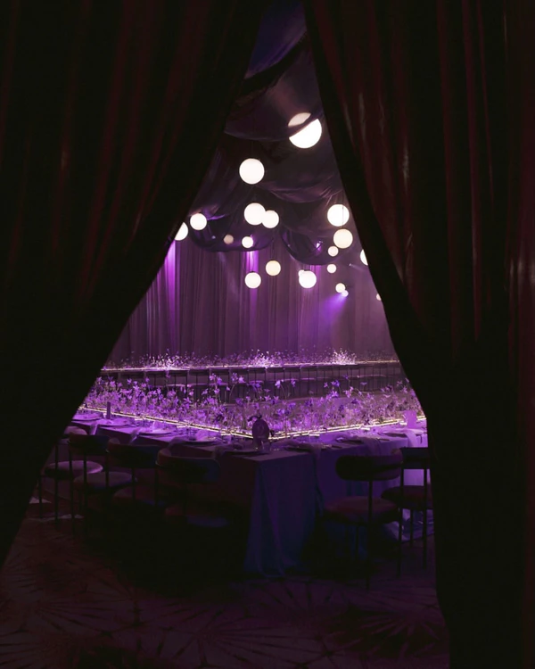
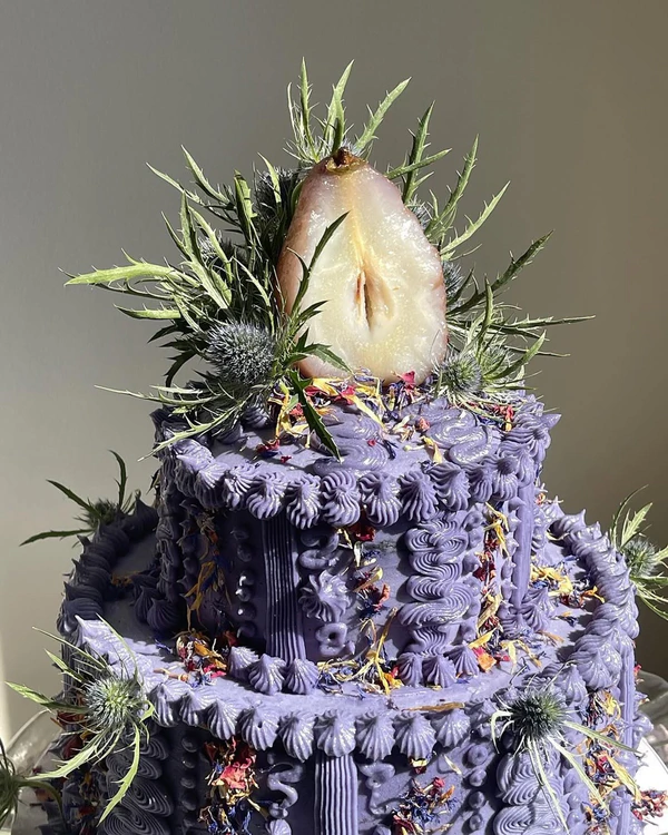
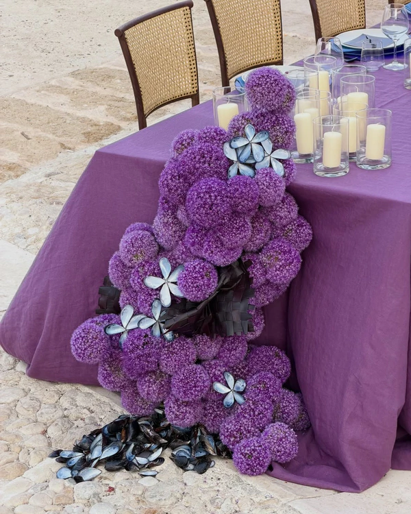
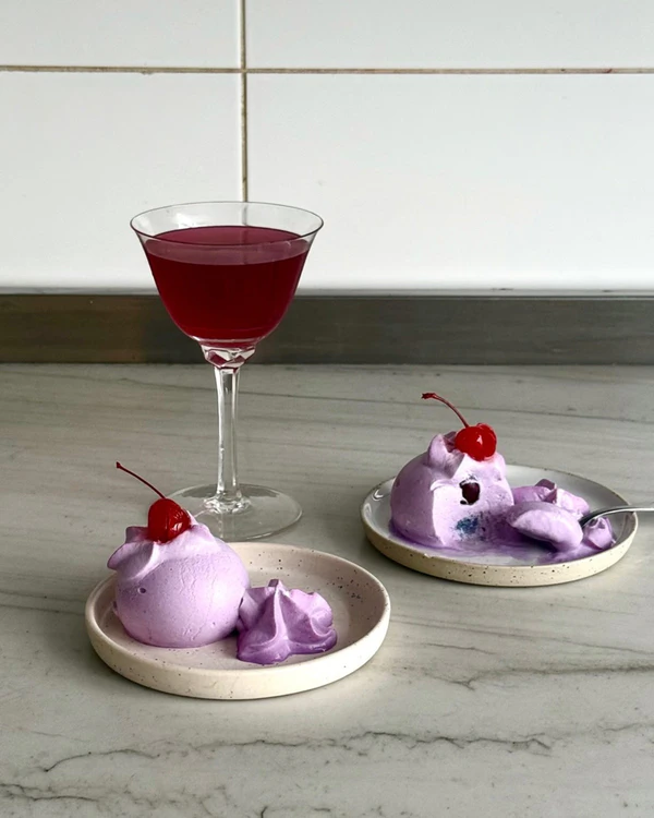
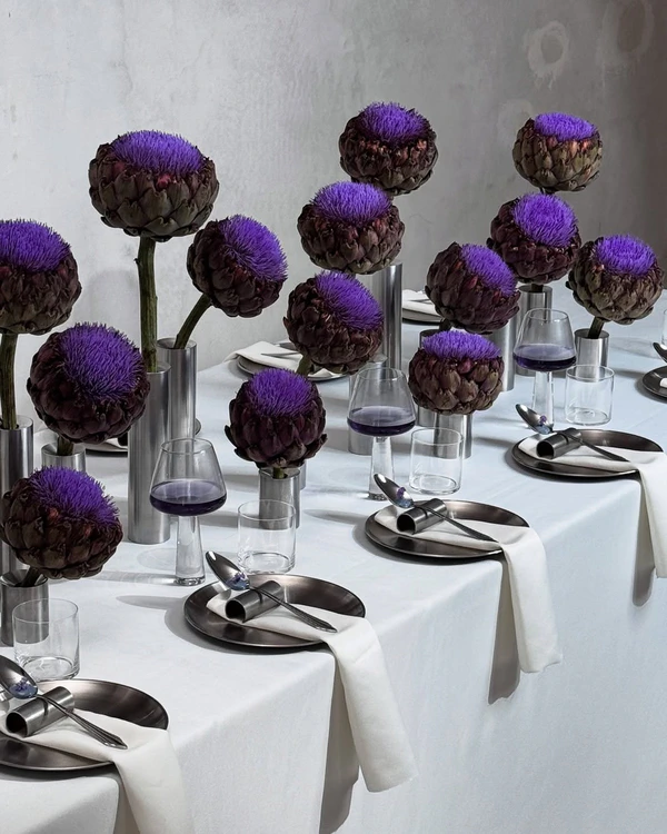
This shade was never really associated with weddings before, but we're so excited to see how it continues to evolve. Orchids, allium, and clematis floral varieties seem to be leading the charge and making a powerful statement as mono-bloom arrangements. Cake designers are also pairing desserts with real, vibrant florals and unexpected buttercream swirls while caterers are creating violet-colored cocktails. Purple opens up endless options, from a single detail to a full monochromatic moment. Under the right lighting it goes moody; against white linens it turns candy-sweet.
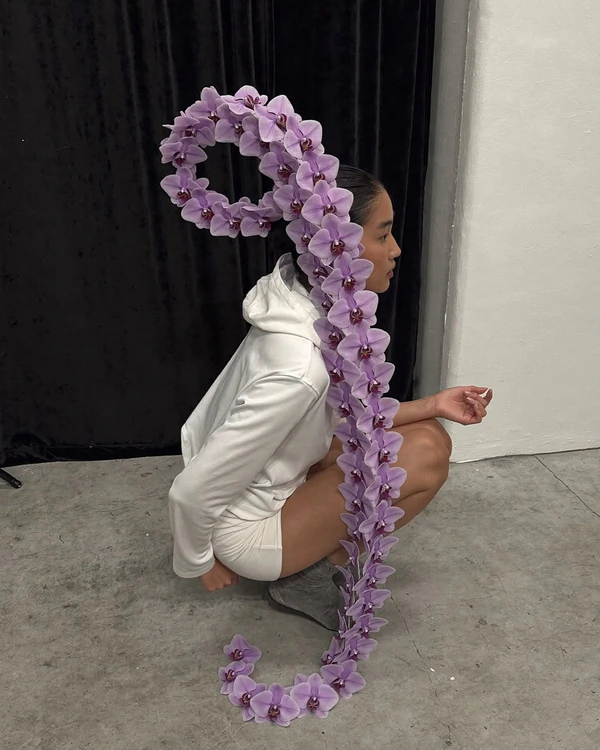
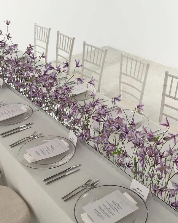
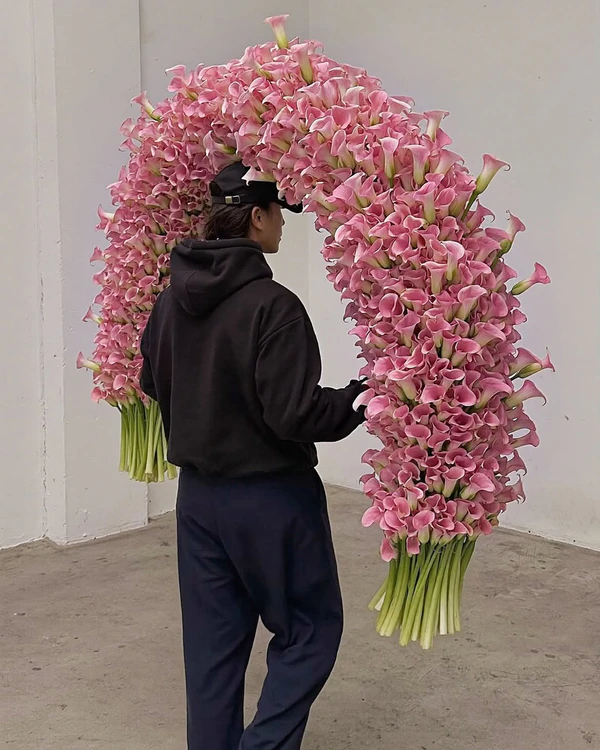
Peony Pink
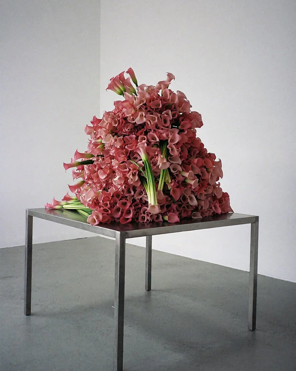
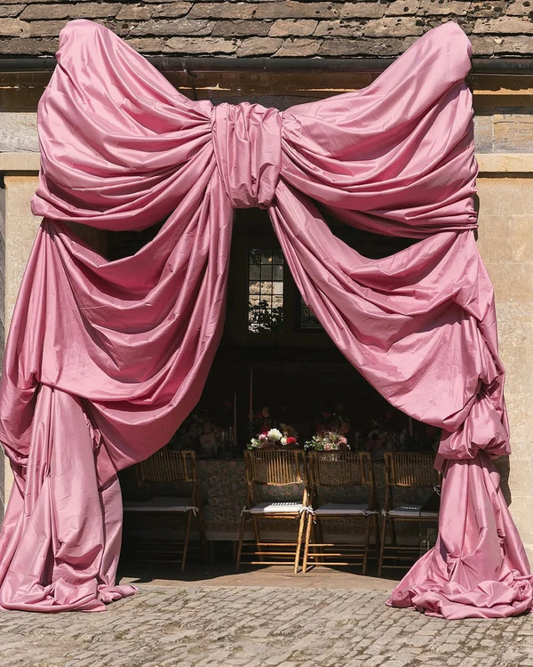
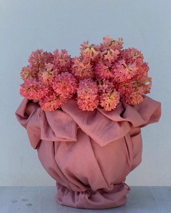
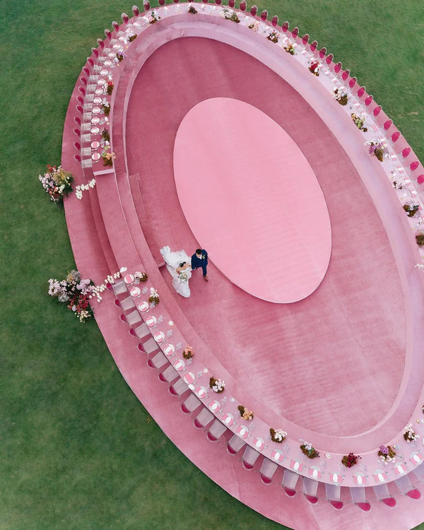
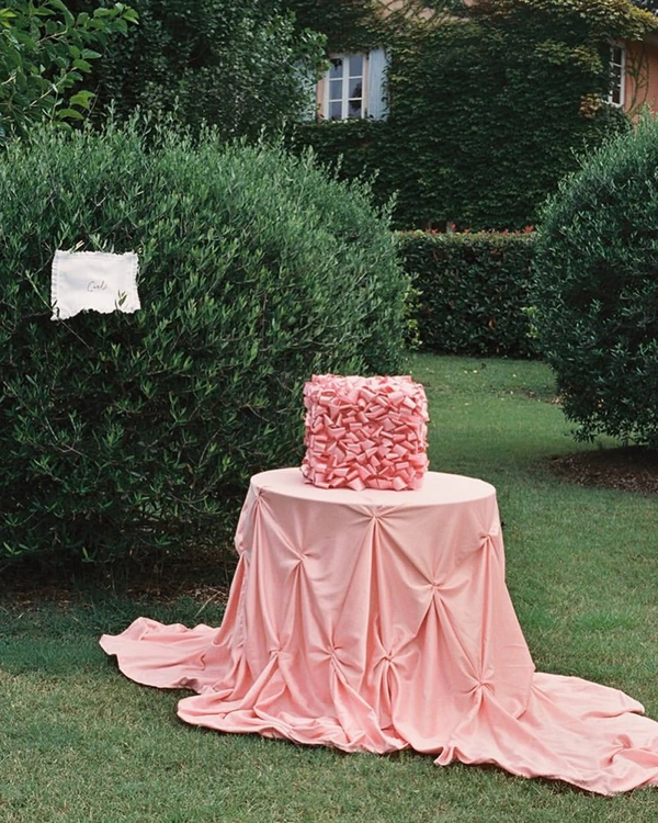
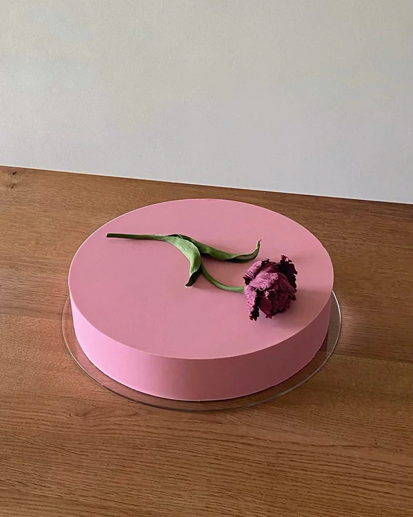
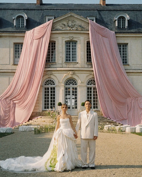
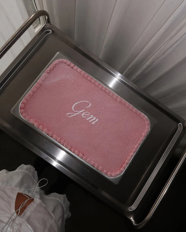
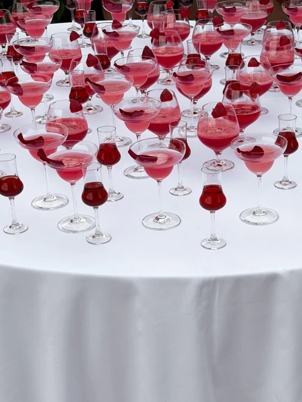
Pink has never looked so good. In 2027, this peony pink hue is going to dominate the wedding industry with its charm, showing up everywhere from stationery suites to the icing on a six-tier cake. Not too dark, not too light, it's the shade of pink you picture the second someone says the word "pink," no further explanation needed. The color has always had a place at weddings, but next year couples are going to embrace it fully, carrying the shade through florals, linens, save-the-dates, dessert, and full-scale installations instead of using it as a single accent. It makes for the perfect focal points and wow moments that just ooze romance.
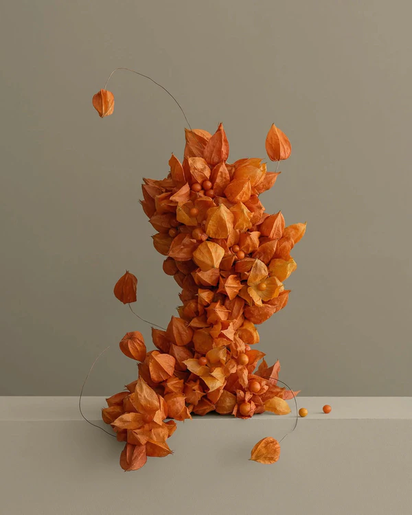
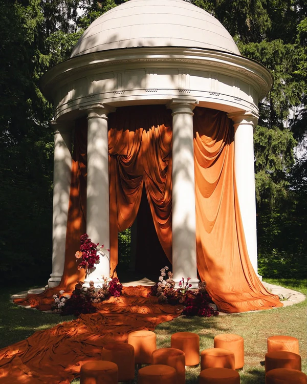
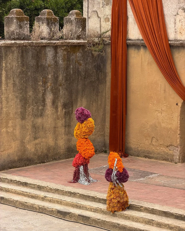
Tropical Orange
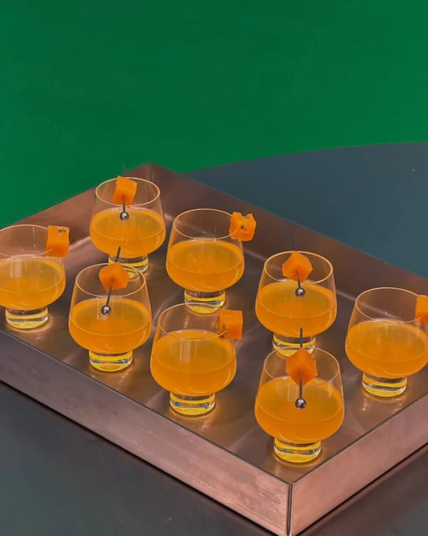
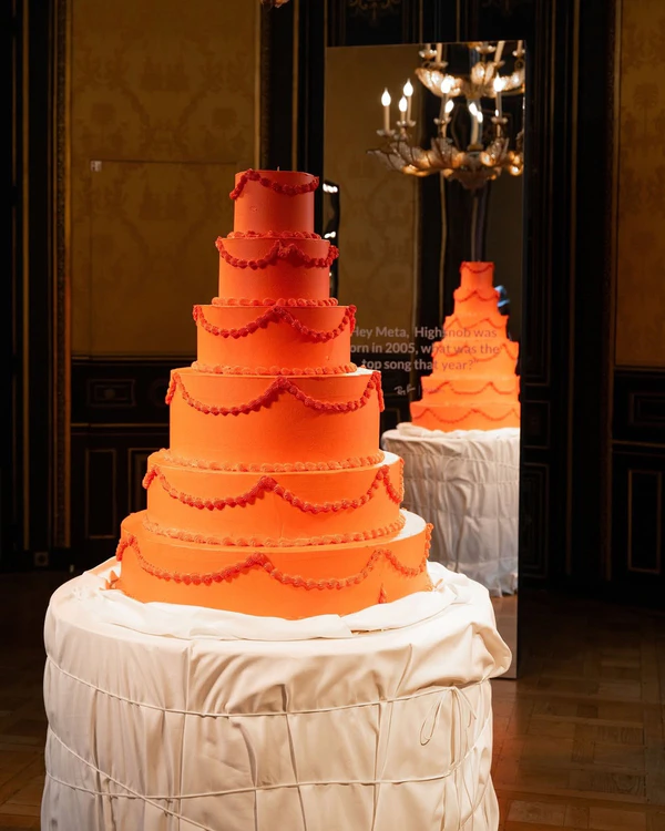
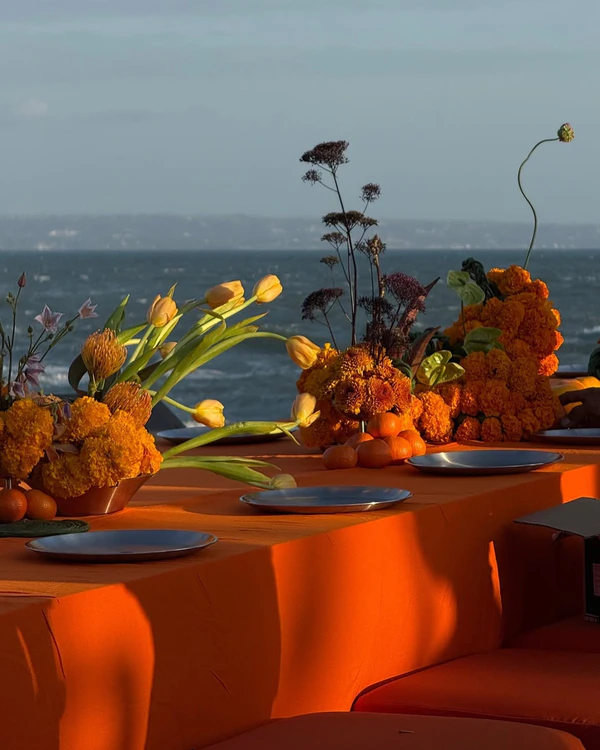
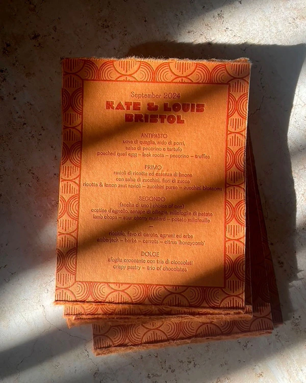
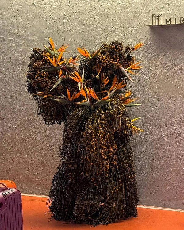
This color feels right at home in warm destinations: a beach in Thailand, a garden in Mexico, or just about anywhere bird of paradise grows wild. Paired with those blooms, it stops looking like a risk and starts looking inevitable, especially in tall, dramatic arrangements that mix in dark green foliage or other vibrant florals. A cake doesn't need to necessarily go full-on orange to join in (but we wouldn't blame you if it did), even a few small decorated details open the door to carrying the shade further, into dishes, drinks, and desserts that pick up the same color scheme. Picture an Aperol spritz in hand, fresh oranges plated alongside dessert, or a citrus glaze that does double duty as both flavor and color cue. On stationery, this might become the main palette of the entire suite, hinting at the tropical vibes that await guests the moment the day arrives. It reads zesty rather than sunburnt, like fresh mango on a summer day.
Berry Red
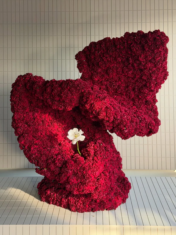
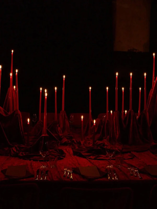
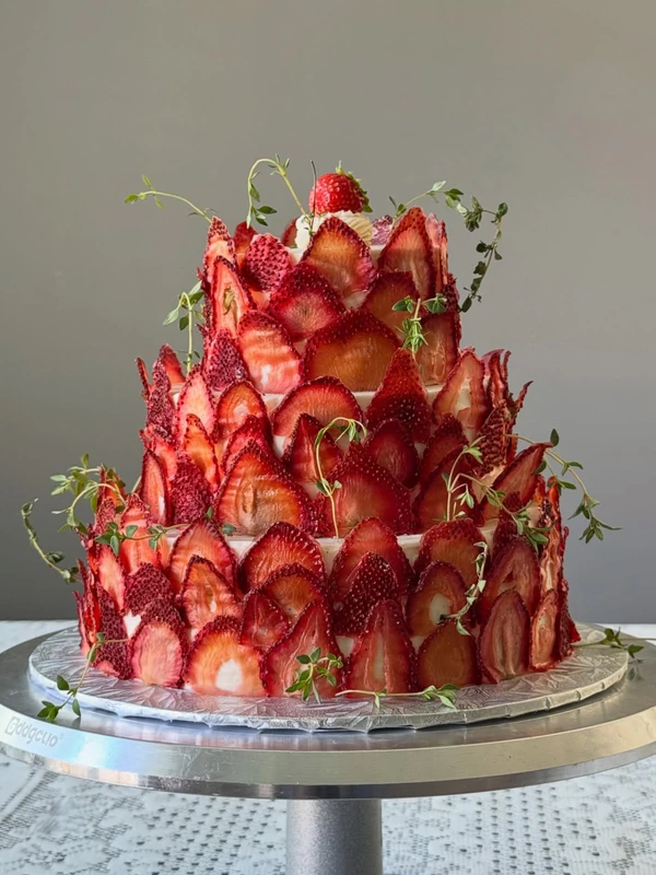
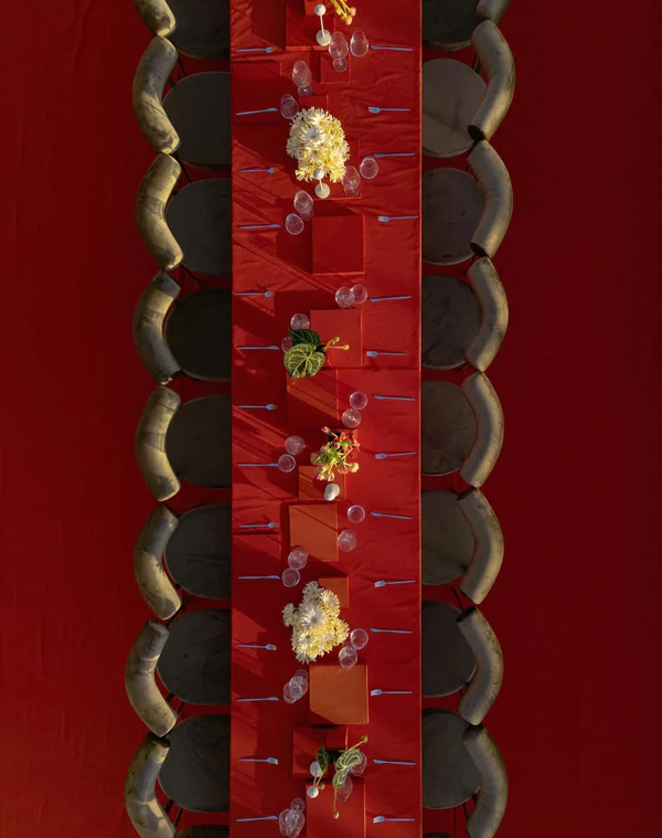
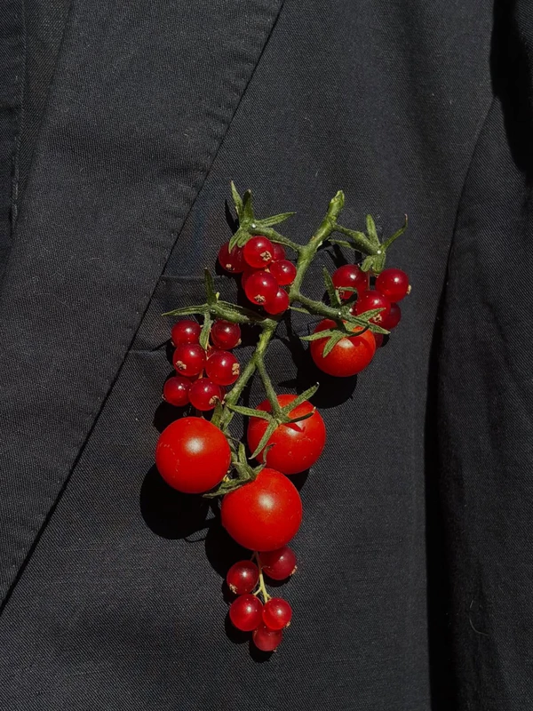
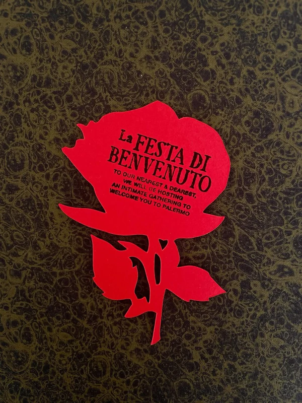
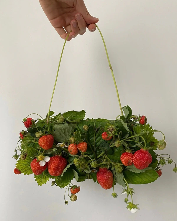
Burgundy had its run in 2026, but next year seems to be hinting at a shade with a bit more juice in it. The tablescape is where the shift into a brighter, berry red is showing up most clearly, reading more fruit stand than wine cellar. Planners are creating bold, monochromatic designs completely swathed in the shade while florists are pulling actual rasperries, cherries, and strawberries into their designs. Even boutonnières have been getting a makeover with small berry and cherry details that add such a unique touch. It works best on its own for the most dramatic designs, or paired with white to give it a more whimsical, garden party approach.
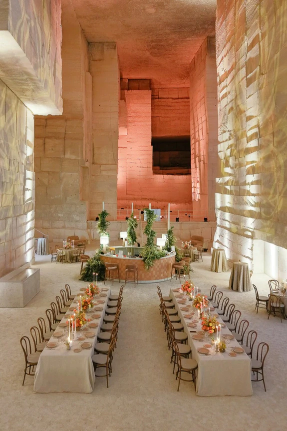
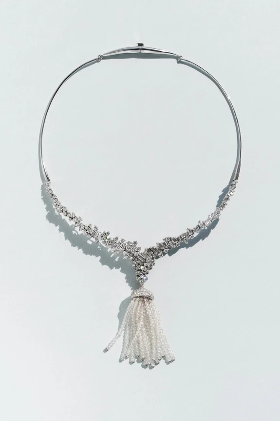
Victorian White
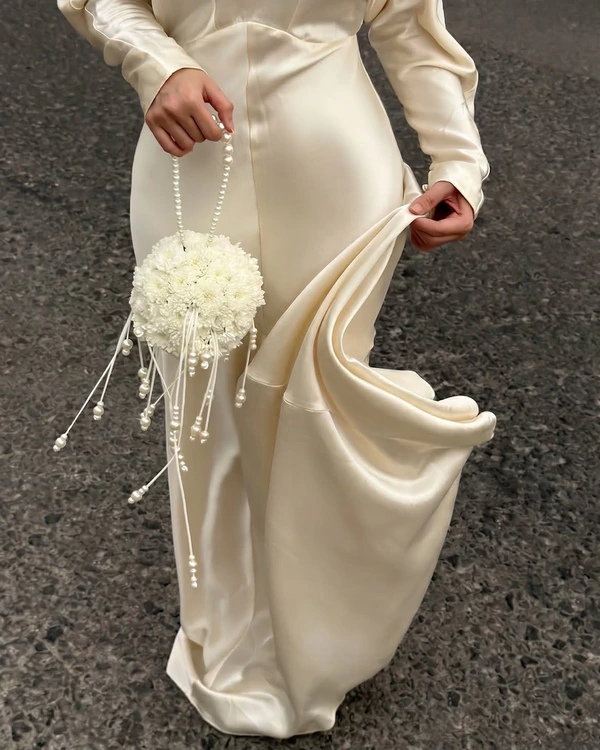
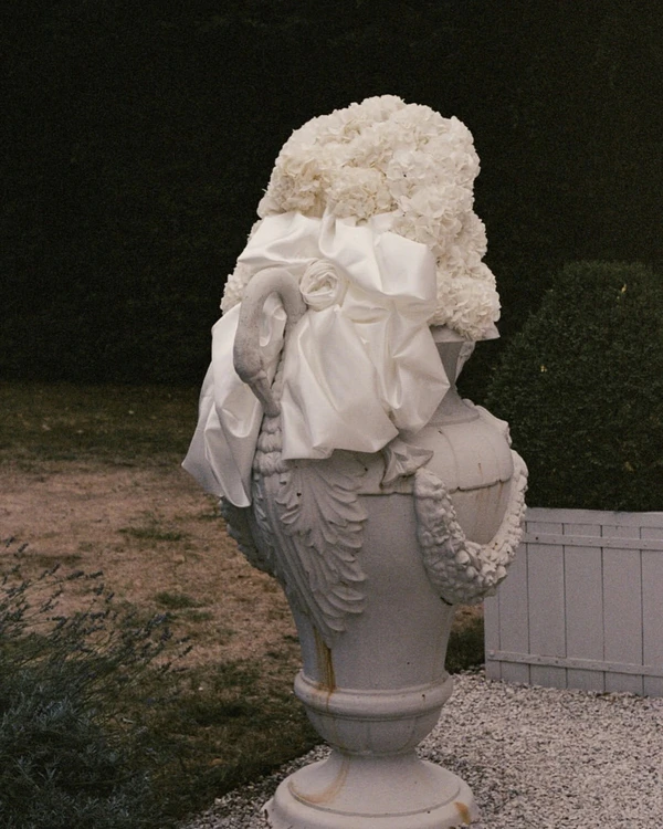
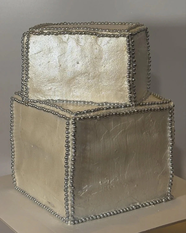
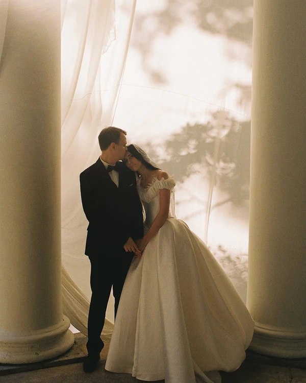
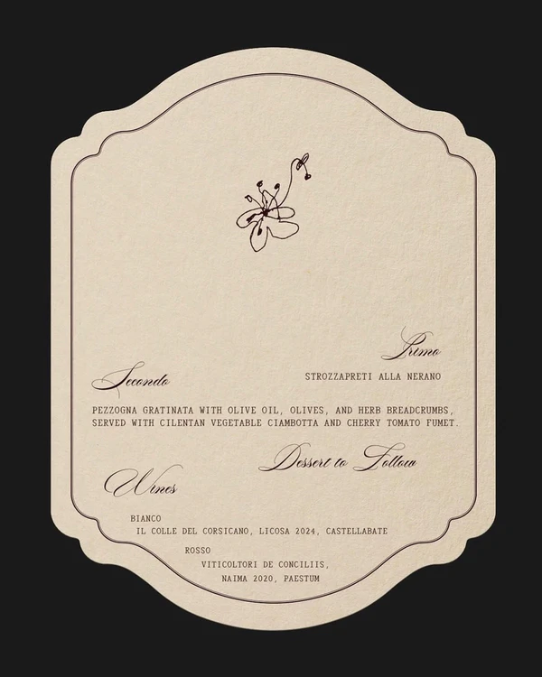
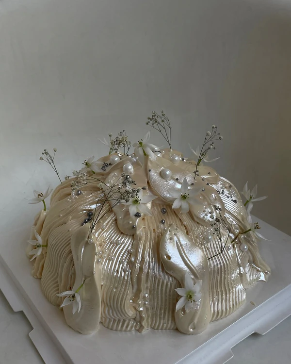
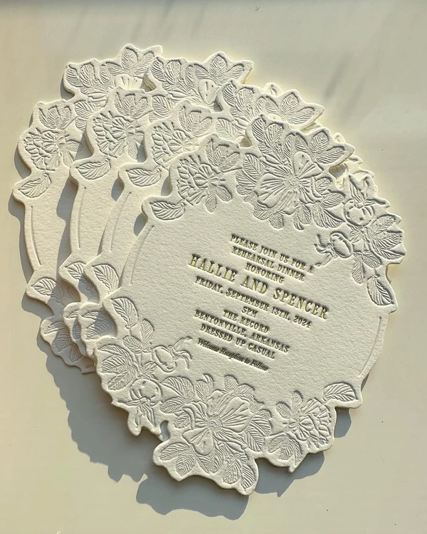
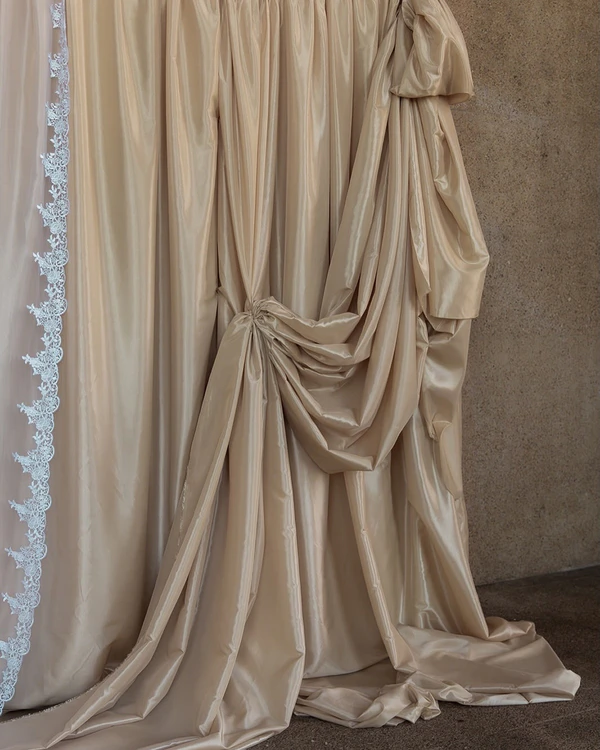
A version of white always seems to make our list, but we promise it's for good reason. Stark whites are being traded for a shade that looks as though it's been steeped in tea: a warm, slightly aged ivory. It photographs like an old photograph already, sepia built in before the film even develops, which is why it makes for the most ethereal atmosphere. Pearlescent finishes on cakes give the color a bit more shimmer, and embossing does the same for stationery. Florals are always an easy place to bring it in, but the shade takes a vendor with the right eye and a steady hand to execute well. If you're dreaming of a vintage-inspired wedding with a softer touch and heirloom vibe, this is the color for you.
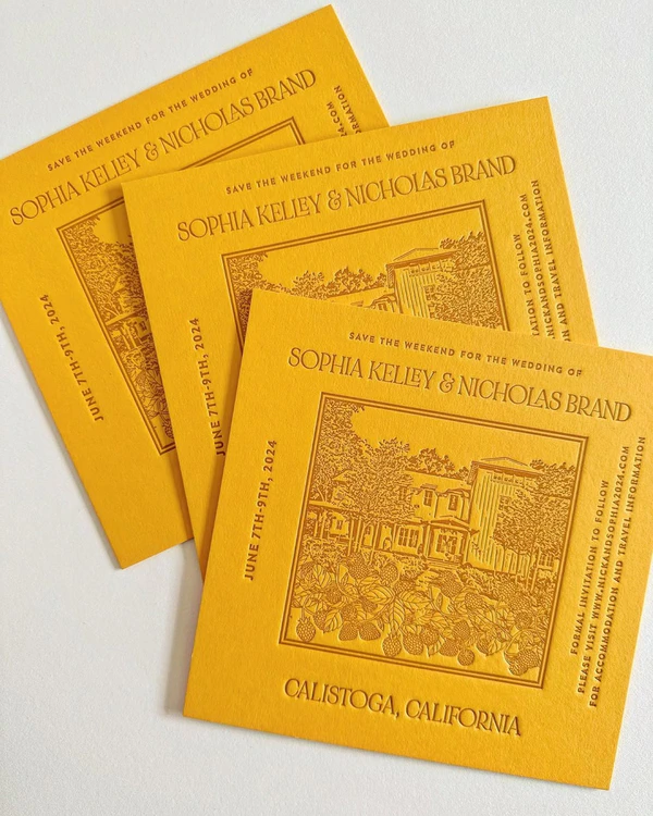
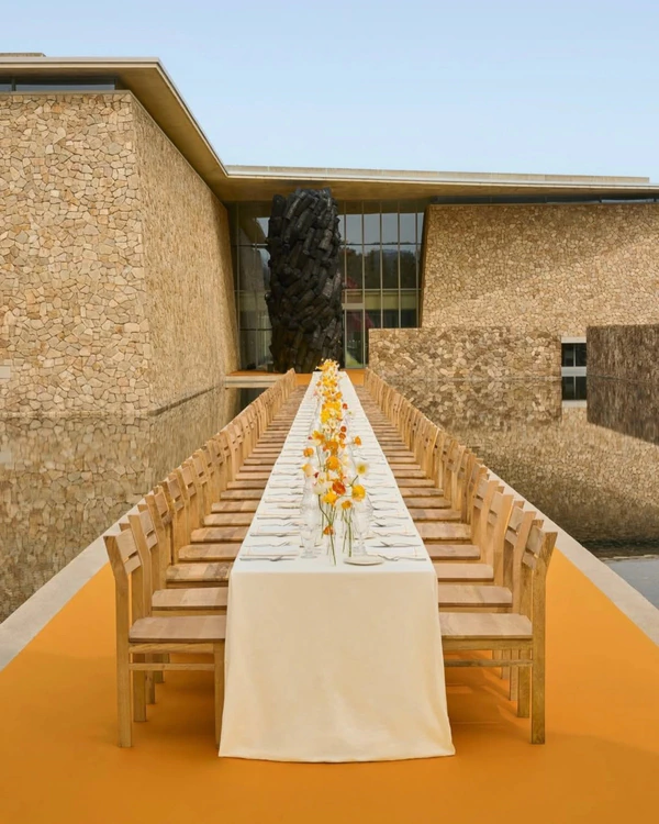
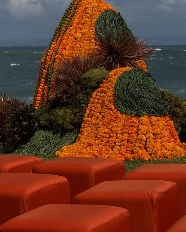
Marigold Yellow
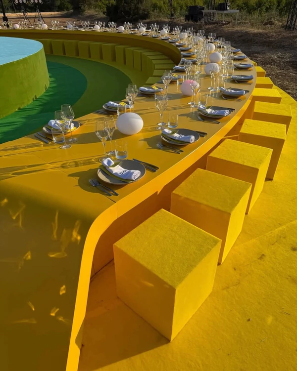
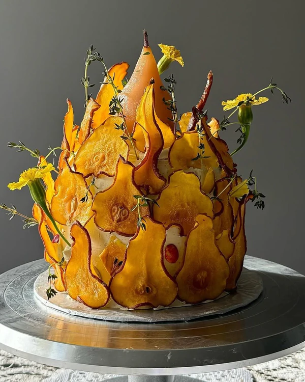
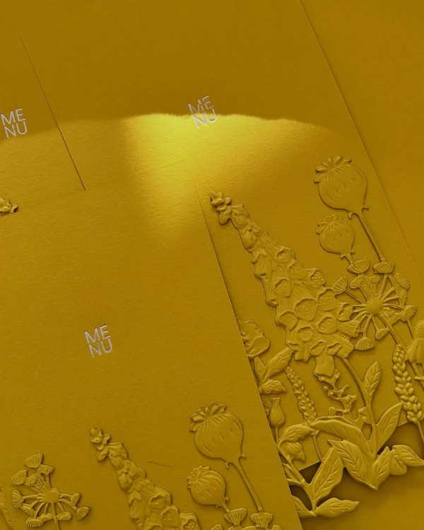
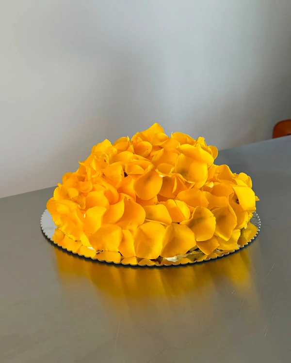
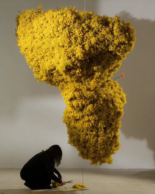
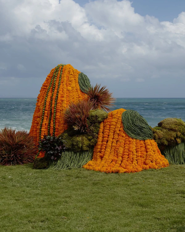
Outdoor venues are where this shade of yellow is showing up first, landing right between sunflower and mustard, warm enough for an outdoor wedding and sharp enough for a city rooftop. It skips the usual cheeriness of yellow, showing up instead as a color with some weight to it, closer to spice than sunshine. On the cake, try covering it completely in flower petals or yellow-hued fruits for an earthy touch rather than a buttercream coat. On stationery, lean into texture and contrasting colors rather than the shade alone. Florals can speak for themselves too, whether in a bold sculptures or single blooms placed along the table. Against green lawns, wheat fields, and blue skies as the backdrop, it holds its own as a sophisticated color that feels like it could never go out of style.