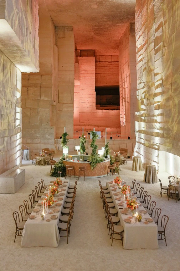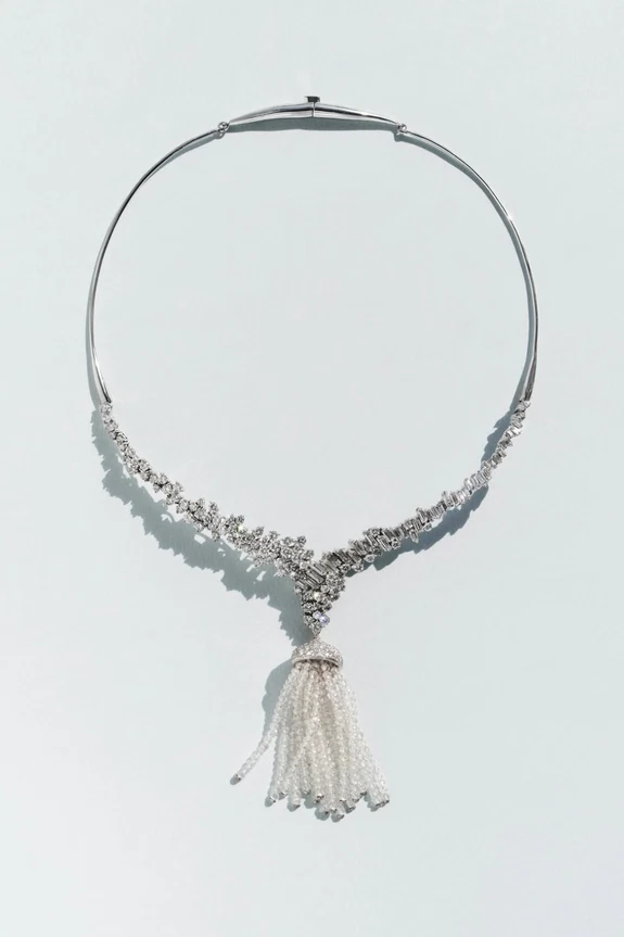
Color hits differently in summer. Brighter against blue skies, more luminous mirrored on the water, and even better once the sun starts to dip. It's a season that invites greater confidence, boldness, and vivacious energy, where even the boldest palettes feel effortless and entirely at home. This year's mood looks beyond expected seasonal combinations in favor of palettes that feel fashion-led, full of personality, and a dash more adventurous than usual. From bold pairings to softer combinations with a modern twist, these are the five color palettes on our radar for summer 2026 weddings.
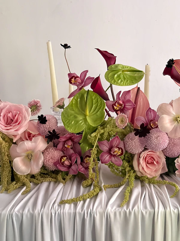
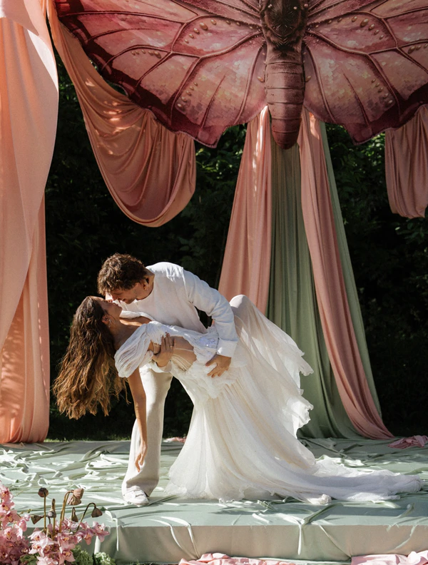
Matcha Green & Petal Pink
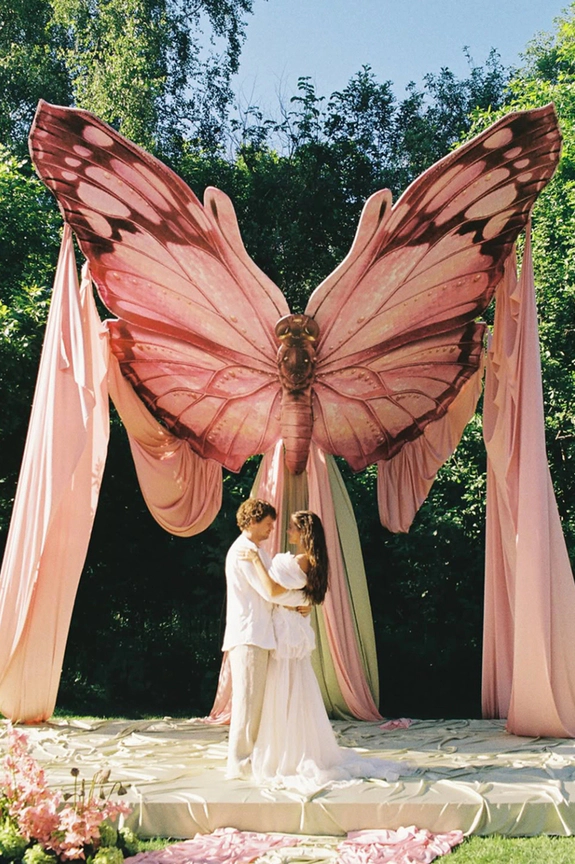
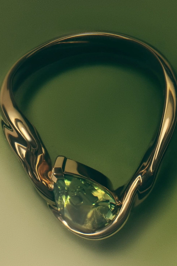
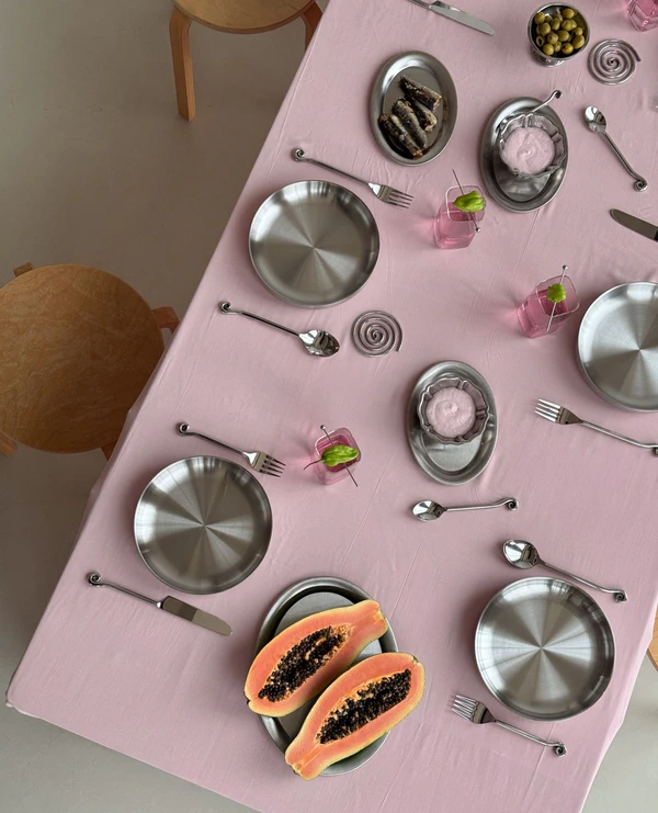
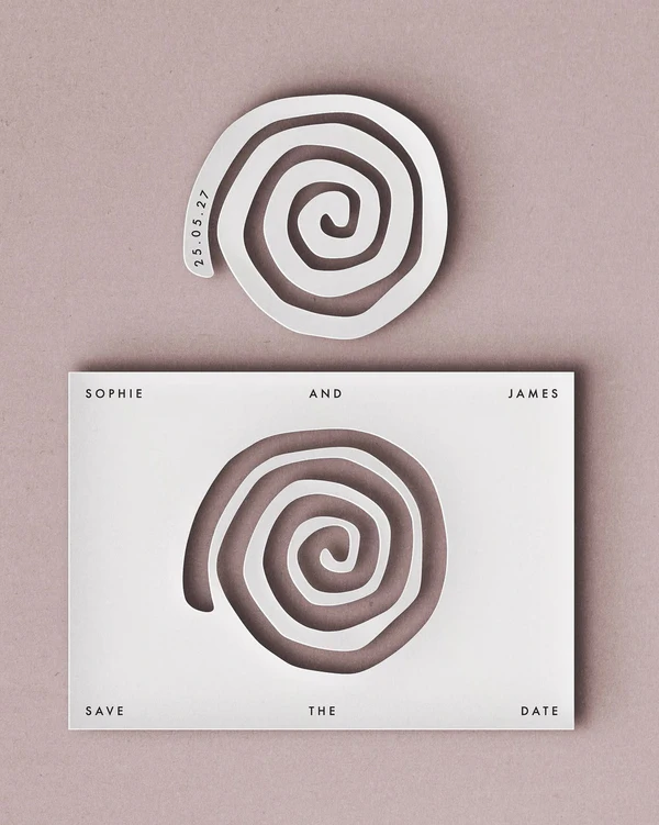
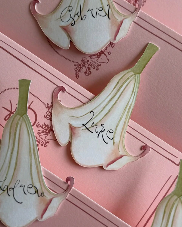
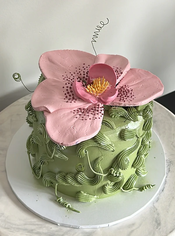
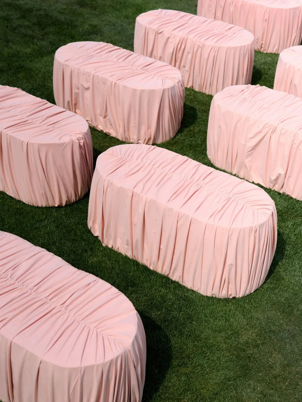
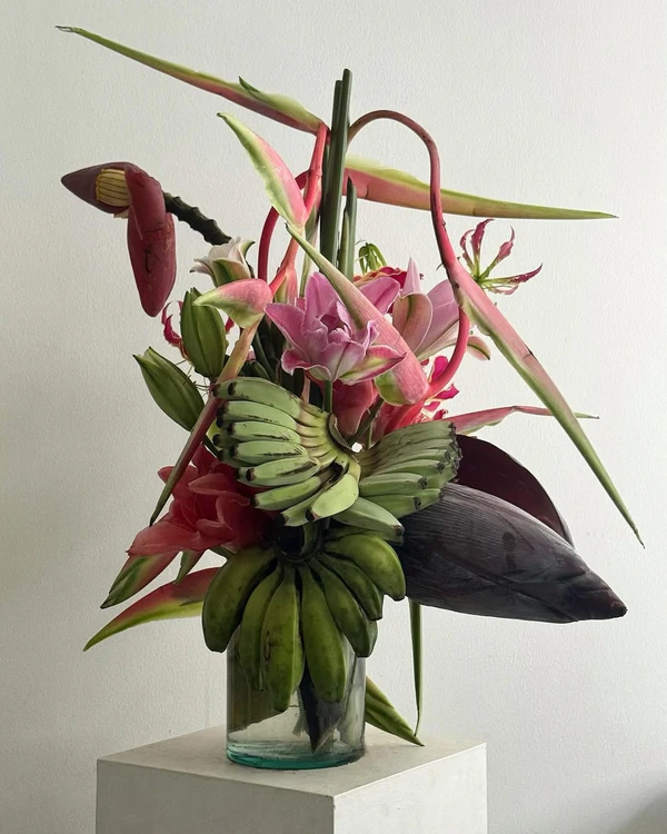
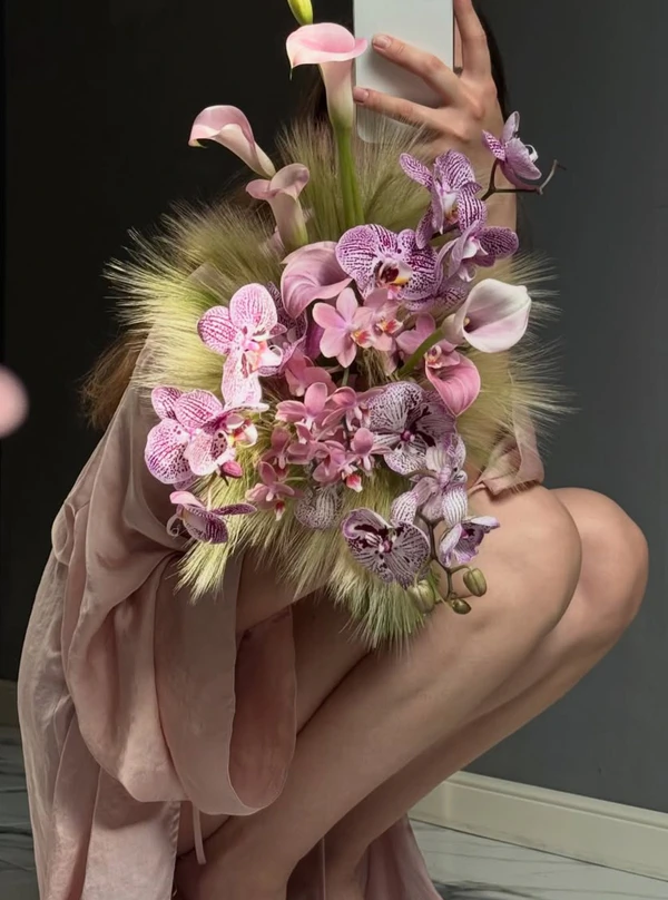
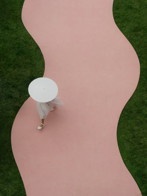
The vitality of green and the softness of pink might be summer’s prettiest plus-one. Matcha brings a calming garden-grown ease, while petal pink adds romance without tipping into sugar-rush territory. Together, they feel light, playful, and quietly fashion-forward, hitting that perfect sweet spot between botanical freshness and soft-focus romance. Perfect for open-air celebrations with an artful, garden-party touch.
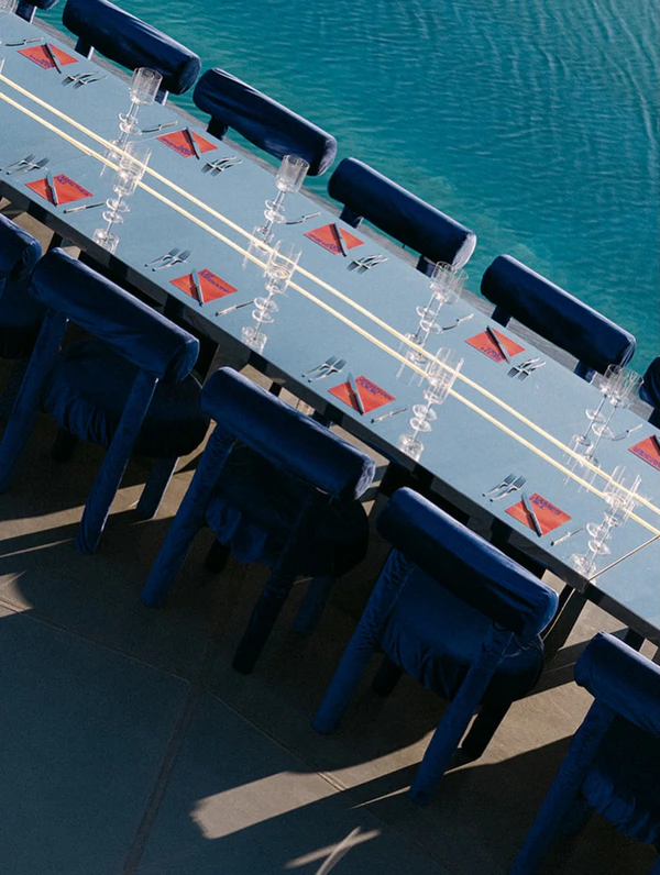
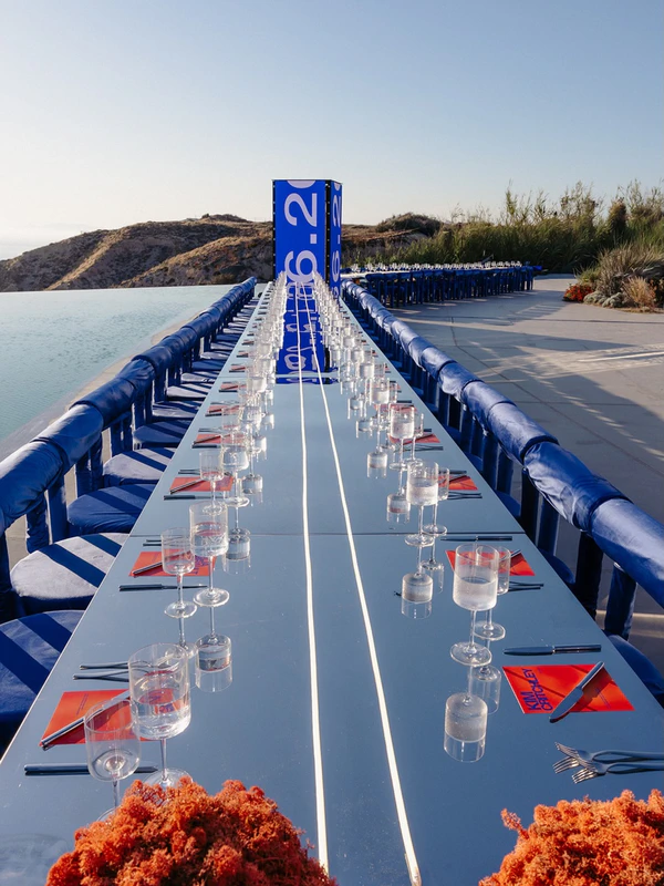
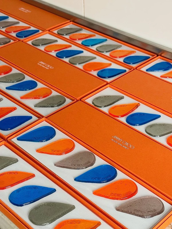
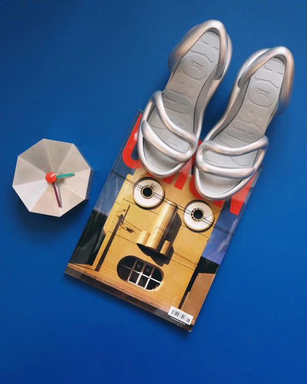
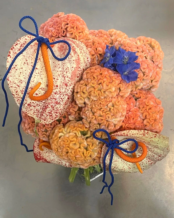
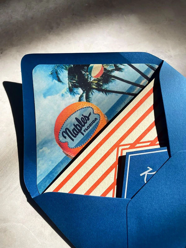
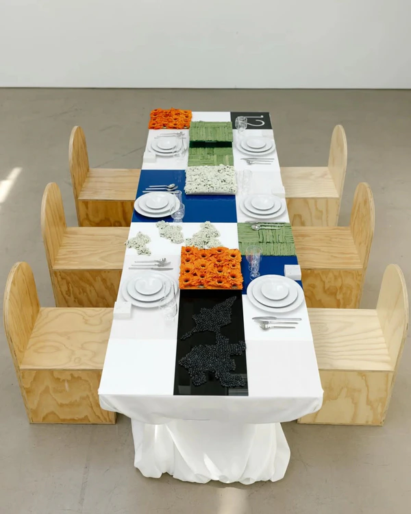
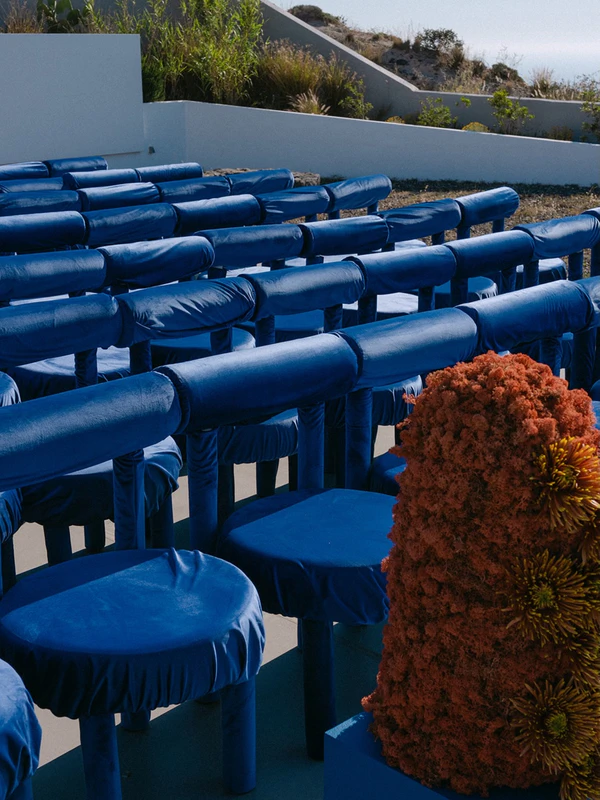
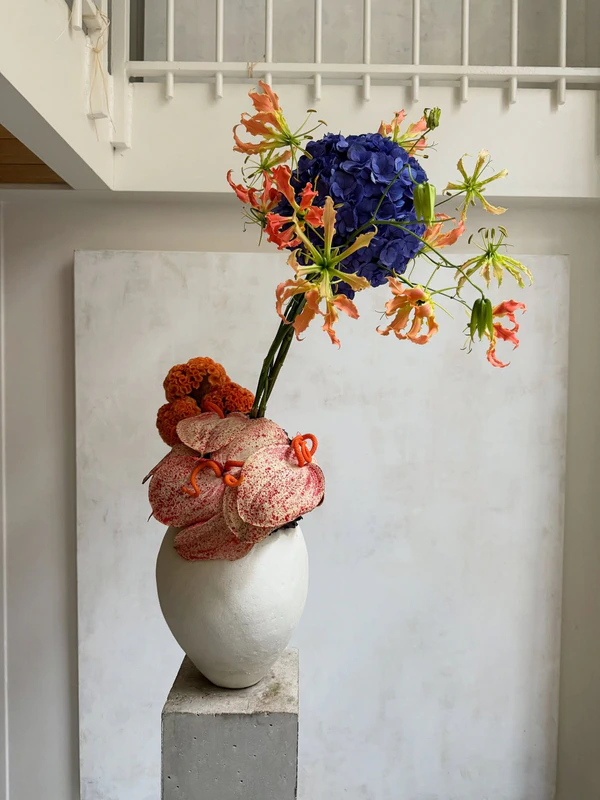
Electric Blue & Aperol Orange
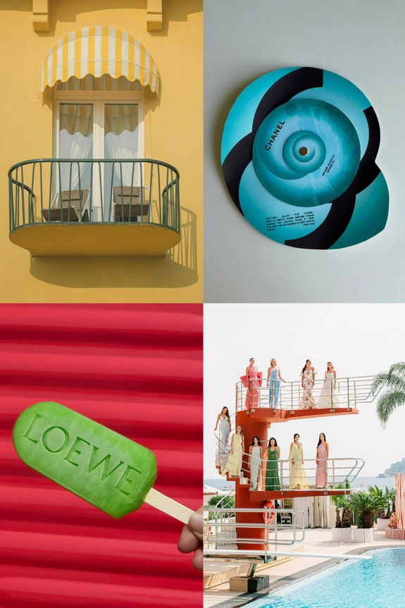
Electric blue and Aperol orange skip pastel prettiness entirely in favor of something bolder: call it summer with its contrast turned up. Blue does the cooling, coastal work with almost architectural precision; orange supplies the heat, all citrus zest and after-hours energy. It’s a pairing with edges and nerve, and that friction is exactly what makes it so memorable.
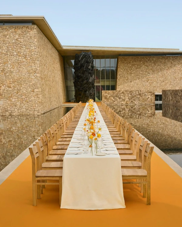
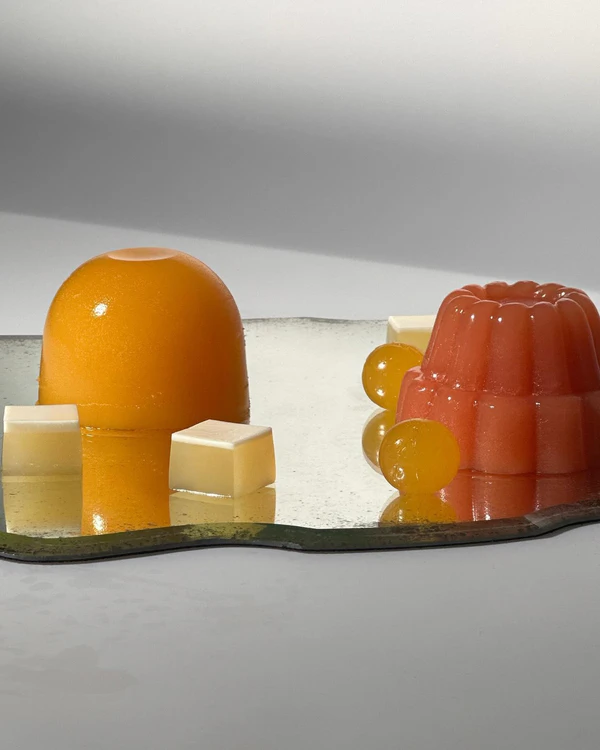
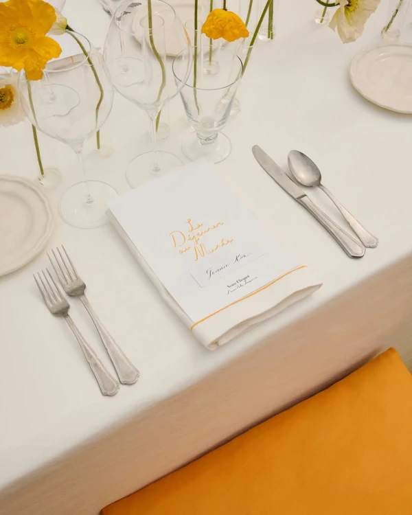
Saffron Yellow & Buttercream
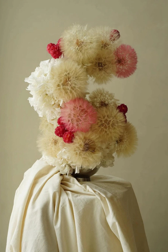
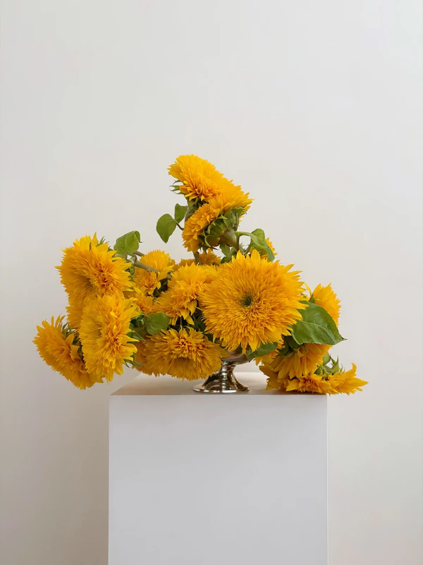
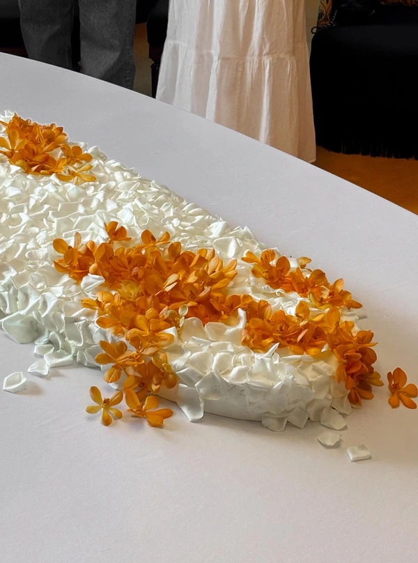
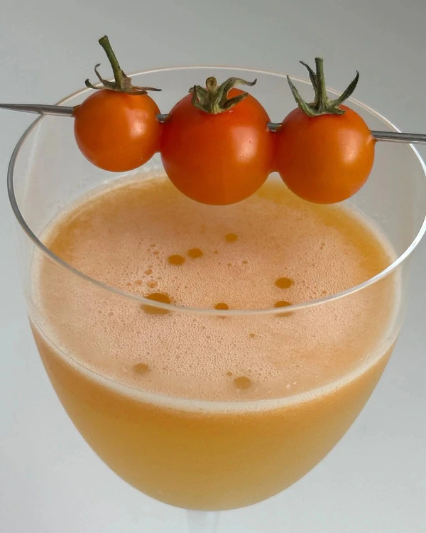
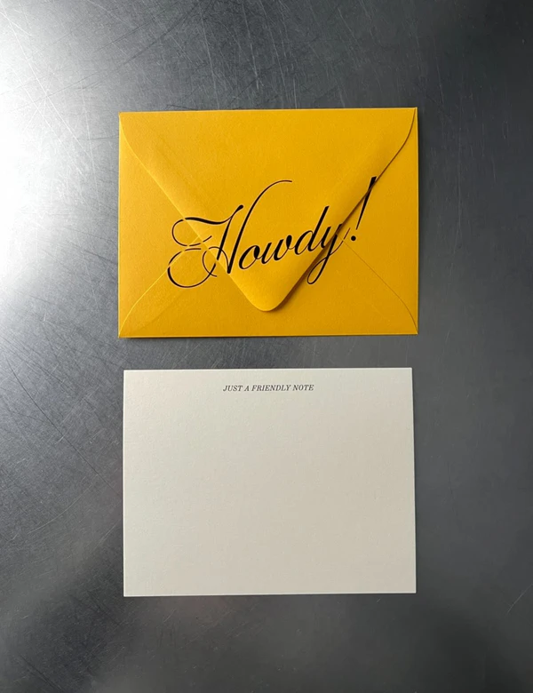
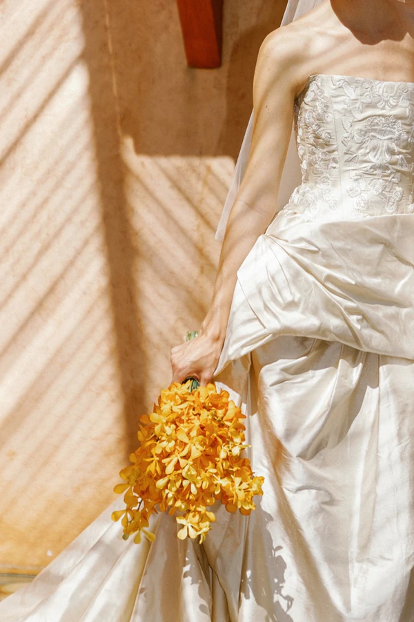
What's a summer palette without a nod to the sun? Saffron yellow and buttercream deliver that light-filled warmth without veering into overly bright or theme-y territory. Cream does the grounding work, giving the pairing room to breathe. Saffron shows up as the wake-up call, a golden hit of energy that keeps things from ever feeling flat. The real beauty of this combination is its range: minimal with clean linens and single-stem florals, romantic with textured blooms and satin, or quietly bold through statement stationery and sculptural tablescapes.
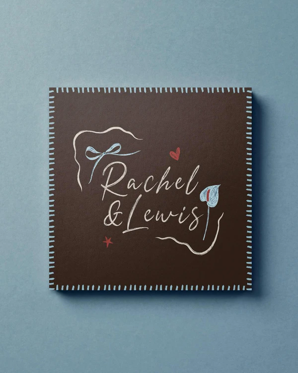
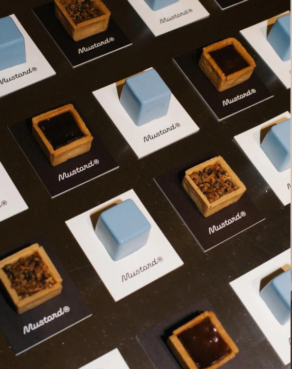
Powder Blue & Dark Chocolate
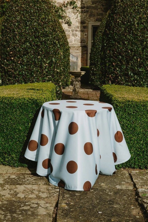
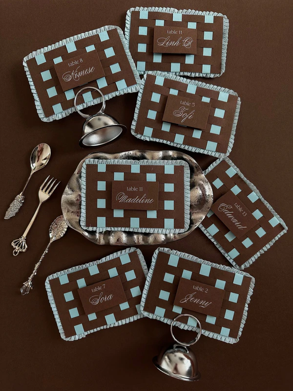
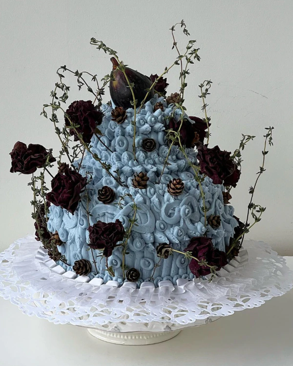
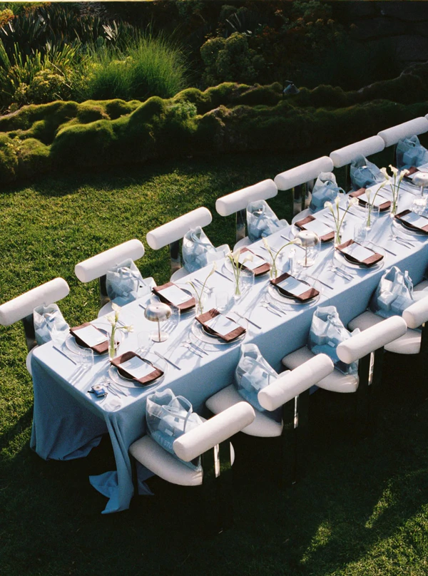
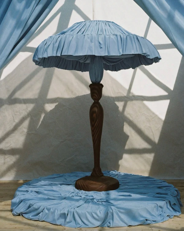
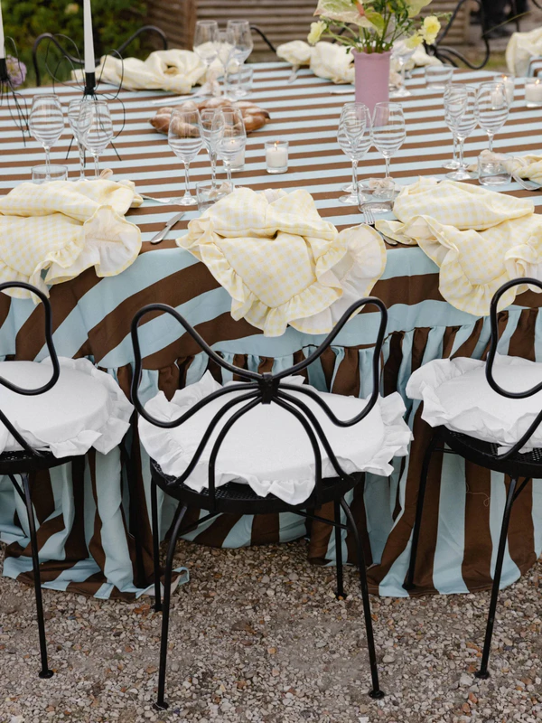
In summer, there’s still plenty of room for moodier, deeper palettes. And if vibrant, high-energy color isn’t really your thing, powder blue and chocolate brown might be the perfect alternative. We love the calmness and quiet depth of this pairing, and the way it feels like sky and earth meeting in one soft, grounded palette. You can shape the mood depending on the setting, too: let chocolate brown lead for something richer and more intimate, or keep powder blue as the main note for a lighter, fresher take that still feels beautifully summery.
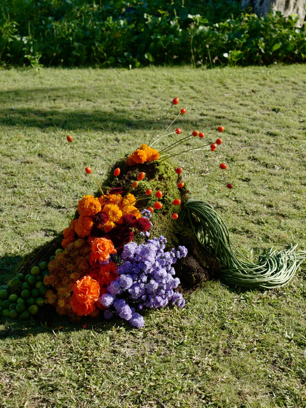
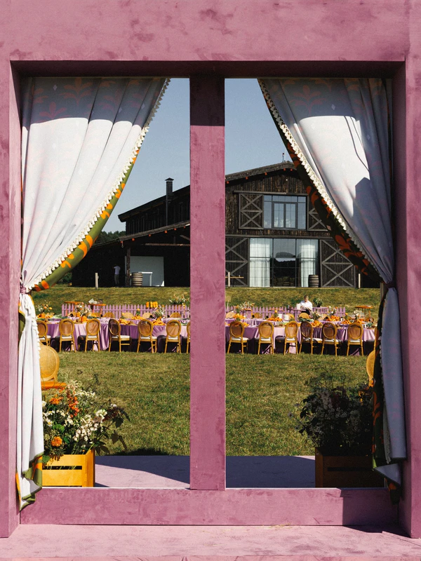
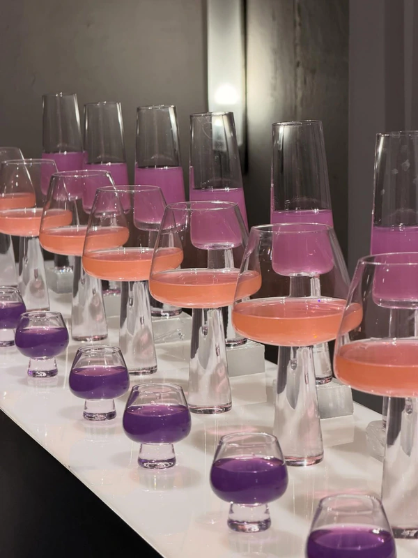
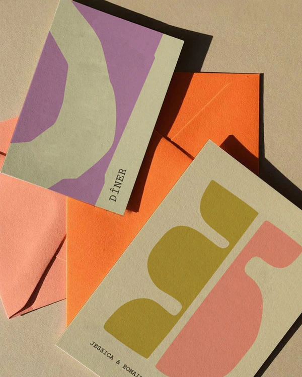
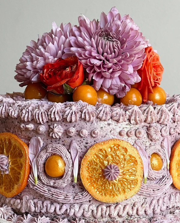
Dusty Lavender & Carrot Orange
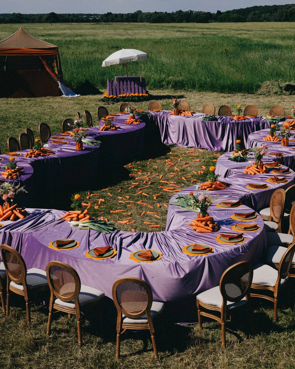
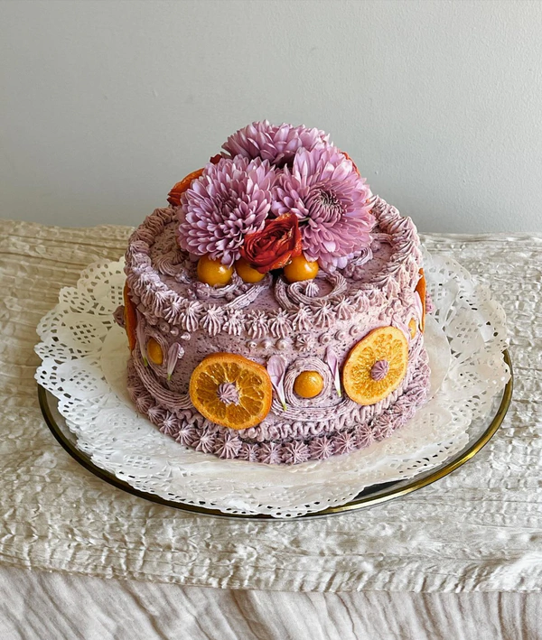
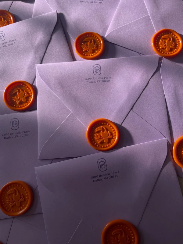
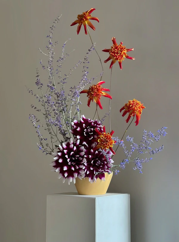
If your heart belongs to hazy August evenings and farm-inspired aesthetics, this pairing might just be your sign: dusty lavender and carrot orange make a surprisingly charming case for late-summer color combo. Lavender keeps things soft and a little dreamy, while orange barges in with all the confidence, keeping the whole thing from getting too precious. Add in rumpled linen, wildflowers, produce as decor, and you've basically got end-of-summer countryside romance in its most photogenic form.